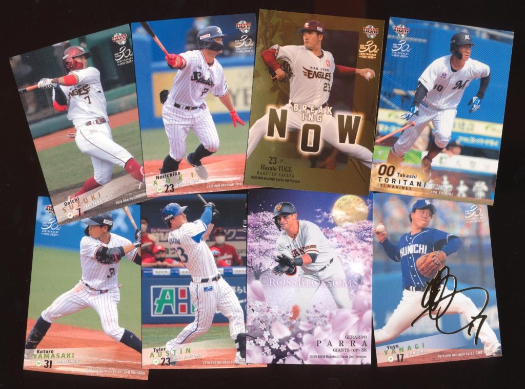
A recent poll for a TV special saw more than 50,000 people in Japan vote for their favorite retired baseball players. 20 players emerged from a pool of 9,000. Yes, they could only vote for players who are no longer active, so you won’t see Shohei Ohtani or other current stars on this list. Which is probably smart because I’m sure Ohtani would win by default. There are, however, players who were beloved but not necessarily brilliant, and foreign stars who found success after coming to NPB. Unsurprisingly, the list leans heavily towards the past 30 years, with a few legends thrown in for good measure.
Over the next few weeks, I’ll be profiling each of these players. Some of these players I know only a little about, so this will be as much a journey for me as, hopefully, it will be for you. It’ll be a mix of history, stats, and whatever interesting stories I can dig up.
For now, have a look at the list below and see how the public ranked them. I’ve included the years they played in NPB in parentheses.
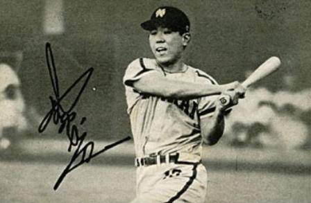
He caught nearly 3,000 games, hit 657 home runs, and never believed he was gifted
If you were playing bar trivia and the category was baseball catchers, the answers would feel obvious.
Who hit the most home runs?
Mike Piazza.
Who finished with the most hits?
Ivan “Pudge” Rodríguez.
Those are good answers. They are also incomplete.
Because in Japan, one man redefined what a catcher could be—hitting more home runs than any catcher in baseball history, winning a Triple Crown at the position, and changing how the job itself was understood.
And the irony is this: Katsuya Nomura never believed he was a natural home run hitter.
That may sound like false modesty coming from a man who hit 657 of them—more than any catcher in the history of professional baseball, second-most in Japanese history behind Sadaharu Oh—but Nomura was serious. He believed power was borrowed, not owned. Something earned through preparation, positioning, and timing, but never brute force.
He believed that if you wanted to understand baseball, you had to understand why the ball went where it did, and why people behaved the way they did under pressure.
Those beliefs did not come from theory: they came from survival.
Nomura’s father went to war when he was two years old and never came home. By three, his father was dead. What followed was not tragedy in the cinematic sense, but something quieter and more exhausting: illness, poverty, and responsibility arriving too early. His mother battled cancer—first uterine, then colon—and spent long stretches hospitalized in Kyoto. Nomura and his older brother Yoshiaki were sent to live with neighbors.
Nomura would later say that poverty itself was survivable. Even hunger was survivable. What stayed with him was learning that in someone else’s house, you could not say you were hungry at all.
When his mother finally returned, he waited for her train hours in advance at a tiny rural station surrounded by rice fields. Only a few trains passed each day. He waded into a nearby stream and chased fish to pass the time. When the train arrived, she stepped down supported by another woman, her face white, her body spent. There was no car so they borrowed a handcart, loaded her onto it, and walked home together—three people, a cart, and a future that suddenly felt very heavy.
At home, she sat silently in front of a small dresser inside their equally small room. She didn’t move and she didn’t say anything. Nomura asked what was wrong. Still, she said nothing. Only later did he understand: she was trying to figure out how to keep her children alive.
Help came from unexpected places. A local factory manager offered her work spinning yarn for carpets. Nomura learned, early, the value of kindness and the necessity of endurance. He delivered newspapers. He babysat. In summer, he sold ice candy wherever people gathered: factory lunch breaks, school fields, festivals.
Without realizing it, he was learning how information worked. If you went where people were, the ice candy sold. If you guessed wrong, it melted in your hands.
When Nomura showed promise in middle school, he aimed for high school baseball. His mother told him to abandon the idea and apprentice somewhere after graduation. It was Yoshiaki who intervened, offering to give up his own plans for college so that Katsuya could continue. Nomura never forgot that trade.
He attended a small, obscure high school—so obscure that, by his own account, they sometimes had to bring in a university student just to hit fungoes before games. Nomura was everything at once: catcher, cleanup hitter, captain, and de facto manager. They barely won. Scouts did not come. He cheated on exams to keep the team alive. He did not know what pitch calling really was. He was, in his own words, just a wall.
That turned out to be enough.
When it came time to chase baseball seriously, he did so practically. He studied the player directory and looked for teams with aging catchers. Two teams fit the bill, Nankai and Hiroshima. Nomura entered professional baseball as a test player for the Nankai Hawks, one of hundreds trying out. Seven were selected. Four were catchers, all from rural areas. Nomura didn’t understand why until later: test catchers were cheap bullpen labor and country boys were thought to be obedient. No one expected them to matter.
His first contract was ¥84,000, paid over twelve months. ¥7,000 a month. ¥3,000 went straight back to the team for dormitory fees. He only took home ¥4,000. When his hometown celebrated him as a professional player and people asked about his signing bonus, he smiled and deflected. “Use your imagination,” he said.
After his first year, having barely played, a team official told him he was being released.
Nomura went back to his dorm room, sat in the dark, and thought of home.
The next day, he returned and begged for one more year. He even offered to play for free.
The team relented and gave him another chance.
His second year nearly ended the same way. Coaches suggested he abandon catching and move to first base; his arm wasn’t strong enough to behind the plate. Nomura accepted the logic but refused the conclusion. He stayed late, throwing long toss every day in an empty stadium. For months, nothing changed.
Then one day, veteran outfielder Kazuo Horii noticed how Nomura gripped the ball.
“That’s a breaking-ball grip,” he said. “You’re a pro and you don’t know how to hold the ball? Turn the seams sideways.”
The throw changed instantly. Nomura had been teaching himself baseball from its first principles and had gotten one of the most basic ones wrong. He laughed about it later and remembered it forever.
He returned to catching because he had done the math. Beating a star first baseman was impossible. Beating a mediocre catcher was not.
He began to watch everything. How hitters reacted to pitches. How pitchers repeated mistakes. How counts shaped decisions. A former journalist working as a scorer agreed to chart pitch sequences for him. Nomura studied them obsessively. He discovered patterns where others saw randomness.
That is the version of Katsuya Nomura that explains everything that followed: the refusal to rest, the obsession with preparation, the willingness to endure being unseen. Baseball did not teach him how to survive. Baseball merely gave survival a uniform.
The numbers followed. Then the power, improbably. Nomura was never built like a slugger. He shortened his swing, widened his grip, focused on contact and rotation. “A home run that barely clears the fence counts the same,” he said.
Catching every day, hitting every day, Nomura became something Japan had never seen: a catcher who did not wear down. A catcher who hit in the middle of the order. A catcher who led the league in home runs.
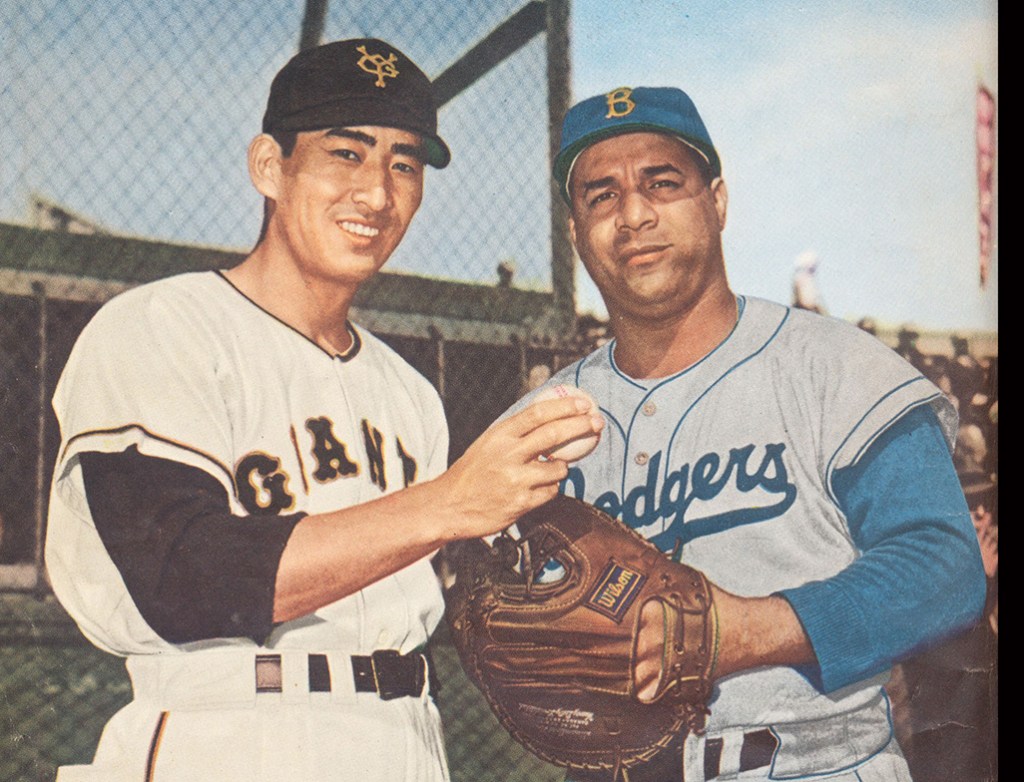
During a Japan–U.S. exhibition series, Willie Mays nicknamed Nomura “Moose,” not for his size or speed, but because he stood still, watched everything, and reacted instantly when it mattered.
He moved from sixth in the order to fifth to fourth. He won batting titles as a catcher—something no one thought was supposed to happen. He led the league in home runs eight straight years. In 1965, he became the first catcher in professional baseball history to win the Triple Crown.
He thought it was terrifying. He had never believed the batting title was meant for him. He had won home run and RBI titles before, but batting average felt different. It depended too much on luck. The batting title arrived because other great hitters like Isao Harimoto and Kihachi Enomoto slumped.
Late in the season, the final obstacle was Daryl Spencer, a former big leaguer playing for the Hankyu Braves. Nankai had already clinched the pennant. Manager Kazuto Tsuruoka was away scouting for the Japan Series. Acting manager Kazuo Kageyama* pulled Nomura aside before a crucial doubleheader.
*In 1965, Tsuruoka stepped down and Nankai named Kageyama manager. Four days later, he was dead. The shock forced Tsuruoka’s return and left a lasting impression on Nomura.
“I’ll take responsibility,” he said. “Walk Spencer every time.”
Nomura hated it.
He was the catcher. He had to call those pitches. Spencer grew visibly angry, eventually holding his bat upside down in protest. Days later, before the race could resolve itself cleanly, Spencer was injured in a motorcycle accident and ruled out for the season.
When reporters congratulated him, he didn’t celebrate. He said only that he wasn’t the kind of person who could rejoice in another man’s misfortune. Later, he admitted something closer to the truth:
“If I’m the only one allowed to be this lucky,” he wondered, “is that really okay?”
He decided the only acceptable response was more work. More swings and more gratitude expressed through effort.
“I am a second-rate hitter,” he said. “That’s why I work.”
He whispered to hitters. He studied their lives. He categorized their minds. He manipulated timing and doubt. Some ignored him. Some rattled. Some fought back. Nomura accepted all of it. This was work.
He worked for 26 seasons. He was behind the plate until he was 45, catching 2,921 games. He became player-manager when he was 35. He was named MVP five times. He endured doubleheaders, summer heat, stolen bases he could no longer stop. He believed the catcher did what no one else could: give shape to baseball’s scriptless drama.
The catcher sees everything first. The catcher absorbs every mistake. The catcher makes decisions that never appear in the box score and lives with consequences that always do. When things go wrong, it is the catcher’s fault. When things go right, it is simply how the game was supposed to go.
When Nomura reached 600 home runs in 1975, the moment barely registered nationally. Nomura played for the Hawks, who played in the Pacific League, and everybody knew that what happened in the PL didn’t matter. Oh and Shigeo Nagashima were dominating headlines for the Giants in the Central League. Nomura understood. He prepared a line in advance.
“If they are sunflowers,” he said, “then I am a moonflower, blooming quietly along the Sea of Japan.”
It became his most famous quote. He even jumped rounding the bases, a rare display. The moonflower, it turned out, wanted to be seen, even if only once.
When his playing career finally ended in 1980, it happened in a way that felt fitting. With the bases loaded and his team trailing by one, Nomura was lifted for a pinch hitter. Sitting on the bench, he caught himself hoping the substitution would fail.
It did.
On the drive home, Nomura realized something unforgivable had happened: he had put himself ahead of the team. That night, he decided to retire. After all, a player who no longer put the team first had already retired in spirit.
Katsuya Nomura caught more pitches than anyone in the history of Japanese professional baseball. He endured more innings, more games, more seasons than anyone should have had to. He also grounded into more double plays than anyone in NPB history.
At his retirement ceremony, Nomura put on his catcher’s gear one last time. His teammates lined up between first and third base. One by one, they stepped onto the mound, said a few words into a microphone, and threw him a ball.
Nomura caught every one.
Nomura once said that if you take baseball away from him, nothing remains.
Zero.
But that was never quite true. Because even when the uniform came off—when the knees finally stopped cooperating, when the dugout door closed for the last time after stints of managing Yakult, Hanshin, and the newly formed Rakuten, Nomura kept doing the same thing he had always done.
He watched.
Because to Nomura, baseball was never a game solely for the gifted.
It was a game for the people who noticed.
Thomas Love Seagull’s work can be found on his Substack Baseball in Japan
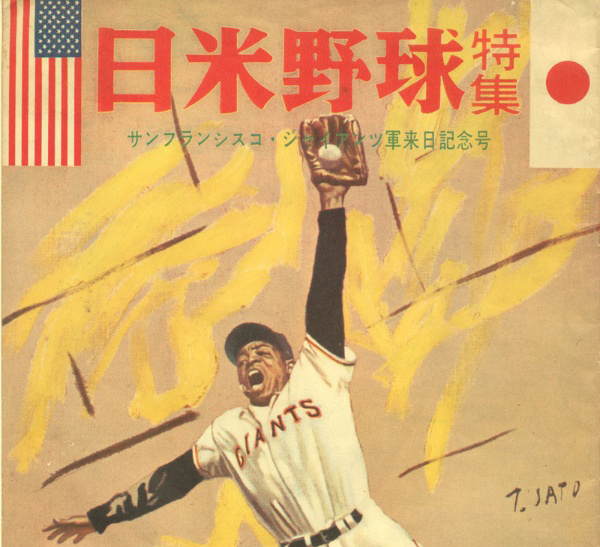
Every Monday morning we will post an article from SABR’s award-winning books Nichibei Yakyu: Volumes I and II. Each will present a different chapter in the long history of US-Japan baseball relations. This week Rob Garratt tells us about Willie Mays and the San Francisco Giants 1960 visit to Japan.
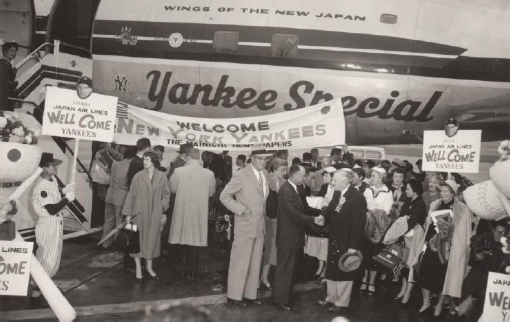
The San Francisco Giants enjoyed a banner year in 1960. After almost five years of planning by the city’s mayor and Board of Supervisors and two years of problem-plagued construction, the Giants’ new ballpark, Candlestick Park, opened in time for the 1960 season. It was a dream come true for Giants owner Horace Stoneham and it justified his move from New York at the end of the 1957 season. The Giants, with a new identity as a West Coast team, now had a permanent location in a new ballpark. The team drew well in its first year at Candlestick, and Stoneham was pleased. And while the Giants would miss out on the National League pennant in 1960, they did manage an exciting postseason, nonetheless. In October 1960, the San Francisco Giants traveled to Japan on a goodwill tour, carrying on a tradition of the city’s connection with Japanese baseball.
San Francisco baseball was known to the Japanese public first through the energy of Frank “Lefty” O’Doul, a San Francisco native who visited Japan in the 1930s with American baseball teams, fell in love with the country and its people, and saw the potential there for good baseball. O’Doul, who is enshrined in Japan’s Baseball Hall of Fame for his contribution to the Japanese game, took his San Francisco Seals Pacific Coast League team to Japan in 1949 (O’Doul was the Seals manager), the first time after World War II that an American team toured Japan. The team’s visit was endorsed by General Douglas MacArthur, the American administrator of Occupied Japan, who felt that the game would lift the spirits of the Japanese people and do wonders for diplomacy between two former foes. The Seals’ visit was a resounding success, with the team greeted by some of the largest crowds that had assembled publicly in Japan since the end of the war. By all accounts it was a successful diplomatic venture with the added bonus that it increased the popularity of the game in Japan.
The Giants’ 1960 tour was the second postwar visit for a San Francisco ballclub and the second for Horace Stoneham as well. Stoneham took his New York Giants to Japan for an exhibition tour in 1953, the first single major-league team to do so. The Giants dominated the 1953 series with Japan, drubbing the Yomiuri Giants 11-1 in the opening game and going on to win nine straight games, finishing the series with 12 victories against one loss and one tie. The Japanese players may have lost on the field, but the Japanese people won their way into Stoneham’s heart. The tour itself made a great impression on the Giants’ boss, who was overwhelmed by the enthusiasm of the Japanese fans, and by the gracious hospitality of the Japanese officials. Treated as an international celebrity, he was moved by the attention and honor paid to the Giants as foreign guests and he was charmed by the country itself – its sights, its food, and its ceremonies and rituals that reflected a deep sense of culture. Stoneham was quoted as recognizing the goodwill gesture of the tour, especially its importance in strengthening the ties between the two countries.
Those 1953 memories were dancing in Stoneham’s head in late 1959 when he received an invitation from Japanese officials for the Giants to return to Japan in the fall of 1960. The proposal was backed by Matsutaro Shoriki, owner of the Yomiuri Shimbun, one of the leading newspaper conglomerates in Japan, and brokered by Tsuneo “Cappy” Harada, a Nisei Japanese American who was helping develop Japanese baseball in the 1950s. Stoneham was so enthusiastic about the invitation that he sent Lefty O’Doul to Japan in the winter of 1959-60 to work with Harada and Shoriki to firm up the plans; O’Doul had been working for the Giants as a consultant since their arrival in San Francisco and Stoneham wanted to take full advantage of O’Doul’s ties with Japanese baseball. The initial discussions went well and by the summer of 1960, Shoriki and Harada presented the Giants with a formal plan for a tour of Japan.
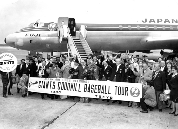
The proposed invitation called for the Giants to play a 16-game exhibition schedule in 10 Japanese cities, under Japanese rules and officiated by Japanese umpires, with participation by San Francisco’s “star players.” Shoriki was careful to insist on Giants star power, knowing that the likes of Willie Mays, Willie McCovey, and Orlando Cepeda would appeal to Japanese fans eager to see great hitting. Stoneham was more than happy to accept and returned the signed agreement in late August 1960. Twenty-two players agreed to travel to Japan, including Mays, McCovey, Cepeda, and a young Juan Marichal, all of them future Hall of Famers. Most of the Giants starters joined the tour as well, among them Felipe Alou, Jim Davenport, and pitchers Jack Sanford and Sam Jones. Included were club officials, headed by Stoneham and his wife, Valleda, acting manager Tom Sheehan, club secretary Eddie Brannick, team publicist Garry Schumacher, and O’Doul.
The organizing Japanese committee pulled out all the stops. The schedule of events upon arrival was nothing short of breathtaking, with almost no hour unaccounted for in the daily routines. Everything was meticulously planned from a television press conference at the airport to a celebrity parade from the airport to the city. Crowds lined the 10-mile parade route and packed the rain-soaked streets in downtown Tokyo as the Giants made their way to the hotel. That evening a welcoming dinner reception was held at the Imperial Hotel and Stoneham read a message from San Francisco Mayor George Christopher, a special greeting to “[our] ‘sister city,’ expressing best wishes to the Japanese people on the 100th anniversary of US-Japan diplomatic relations.” On the second day more ceremonial activities took place as the Giants toured Yomiuri’s headquarters, visited the Nihon Television Studios, where the players were interviewed and introduced to Japan’s national TV audience, practiced for 1½ hours at Korakuen Stadium, and attended a reception in their honor at the US Embassy, hosted by Ambassador Douglas MacArthur II, the nephew of General MacArthur. Japanese planners had thought of every probability, working in “alternatives” for events and sightseeing, in case of changes due to bad weather. In what must have seemed a whirlwind pace of parades, receptions, and ceremonial lunches and dinners, the Giants, with very little time for themselves, might have thought that a game of baseball was almost anticlimactic.
The 1960 San Francisco Giants arrive in Japan (National Baseball Hall of Fame Library, Cooperstown, New York)
On the third day, the time finally came for the Giants to face the Yomiuri Giants in the inaugural game of the tour. But the visiting players would wait again as the game provided the Japanese with yet another opportunity for pregame pageantry, described by one source as part parade, part theater spectacle, as “shapely Japanese models and the Tokyo police band led the Japanese and American Giants around Korakuen Stadium as fireworks exploded, and balloons and pigeons soared skyward.” Once the teams had finished the procession and the air had cleared, Ambassador MacArthur read a greeting from President Dwight Eisenhower that recalled the long history of exchanges between Japanese and American baseball players, noting the important role of the national pastime in both countries. The president’s message stressed the importance of this year’s exhibition series as a promotion of “the spirit of international understanding and co-operation essential to the peace of the world.” Then Matsutaro Shoriki threw out the traditional first ball and the game officially began, at last.
Initially things did not fare well for the visitors, who were perhaps weary from international travel and overwhelmed by welcoming ceremonies. In the first two games of the scheduled 16-game tour, the Japanese beat San Francisco, much to the surprise and chagrin of some of the local sportswriters, who expressed a tinge of disappointment over the Japanese success. Writing for the Japan Times, Katsundo Mizuno labeled the Giants’ start as the “worst of any major league outfit” that ever visited Japan, and he wondered what was wrong with them. The headlines in the local coverage of the opening game reflected a mixture of shock with a dash of hyperbole: “Tokyo’s Yomiuri Giants Bomb San Francisco, 1-0” although the Japanese managed only two hits against Giants pitching.
The first game was the only one in which San Francisco faced players from a single team. For the rest of the exhibition tour, the Giants played squads of all-stars drawn from the two Nippon Professional Baseball leagues. The Giants lost the second game, but managed a win in Game 3, prompting the Japanese journalists to collect their breath, astonished by the Americans’ poor start. “By squeaking past the Japan All-Stars 1-0 at Tokyo’s Korakuen stadium yesterday, the Giants have averted unheard of catastrophe for major league baseball. No visiting U.S. big league team has ever lost three games in a row in Japan.” Hisanori Karita, a veteran Japanese baseball commentator, was quoted as demanding more “major-style action” from the visitors.
When questioned by the Japanese press about their slow start, Giants players and team officials responded politely and diplomatically, although privately they must have wondered what the fuss was about, given that they were adjusting to international travel, a frenetic welcome schedule, and a foreign cultural environment. Interim Giants manager Tom Sheehan tried some American tongue-in-cheek humor, “I understand we’ve set a new record for major leaguers by losing two games in a row. We may lose all the remaining games, too, you know.” “We’ll play better tomorrow,” he added.
The folksy Sheehan proved a truthful prognosticator. Games 4 and 5 were on the road, in Sapporo and Sendai, and the San Franciscans won them both, with plenty of offense including four home runs, three of them by Willie McCovey. The Giants then returned to Tokyo for two more games at Korakuen Stadium, which they split with the host team, giving them a 4-3 record for the series as they prepared to play the rest of the tour “on the road.” One highlight for the American squad was the attendance of Japanese royalty in Game 6 at Korakuen. Crown Prince Akihito and Crown Princess Michiko, guests of Matsutaro Shoriki, watched the Japanese all-stars erupt for 10 runs – the most they would score in any game of the tour – and beat the Giants, 10-7, before 32,000 fans. The crown prince and princess saw Willie Mays homer in the game, and then watched All-Star Isao Harimoto answer with a two-run blast of his own.
For the remainder of the exhibition tour, the Giants played outside of Tokyo, on a swing throughout southern Japan taking them to seven cities: Toyama; a three-game series in Osaka; Fukuoka; Shimonoseki; Hiroshima; Nagoya; and finishing in Shizuoka. It was on this road trip that the Giants found their mojo, winning seven straight games. But it was the manner in which they won that was impressive. Unlike the games played in Tokyo, which were usually low-scoring and tight, most of the road games were one-sided, with the Giants’ bats coming alive, much to the delight of the Japanese fans, who expected to see home run fireworks from the likes of Mays, McCovey, and Cepeda.
After an unusual game in Toyama in which the Giants banged out three home runs in the first inning to take a seven-run lead, only to see the All-Stars claw their way back, highlighted by a three-run homer by Kenjiro Tamiya off Mike McCormick – the game ended in 10 innings in a 7-7 tie – it was on to Osaka. The Giants found this stop to their liking, sweeping the three-game series in front of enthusiastic Osaka fans (the three games drew 90,000). During the Osaka series, they also enjoyed a day off touring the historic city of Kyoto.
Then it was on to Fukuoka, where the Giants won decisively, 8-4, and then to Shimonoseki, where they beat the all-star team, 11-5, in a demonstration of offensive fire, hitting four home runs. In an example of the goodwill that underscored and permeated the entire baseball tour, there was a somber and emotional moment when the Giants arrived in Hiroshima. Prior to the game, which the Giants won, 4-1, Stoneham led the players and team officials to the Hiroshima Peace Memorial Park, where both Stoneham and Sheehan placed bouquets of flowers by the Memorial Cenotaph in a solemn ceremony honoring the memory of those Hiroshima citizens who died in the final days of World War II. After Hiroshima, the Giants traveled to Nagoya and put up big numbers once again in a 14-2 win. The last game of the tour was played at Shizuoka’s Kusanagi Stadium on November 13, won by the Japanese All-Stars, 3-2. The Giants totals for the series were 11 wins, 4 losses and 1 tie. After the game, the Giants boarded a train to Tokyo for three days of sightseeing before they flew home on Friday, November 18.
*****
Despite their slow start, the Giants finished their exhibition goodwill tour of Japan with a flurry and put up impressive numbers for the series, hitting 31 homers over 16 games, much to the delight of the Japanese fans; McCovey hit eight home runs, Mays seven, and Cepeda five. Mays hit .393 for the tour and was named by the all-star and Giants managers as the series’ Most Valuable Player. Giants pitching was strong as well, with an overall 2.41 ERA and 92 strikeouts in 142 innings. Sam Jones had a 3-0 record with an amazing 0.82 ERA; Juan Marichal posted a 1.55 ERA with a 2-0 record and a complete game; Mike McCormick had 22 strikeouts in 23 ⅔ innings. In a memorable and significant moment for Japanese fans, Jones displayed his own version of goodwill when he went over to first base after hitting a batter and apologized to the hitter. There were other friendly exchanges between the Giants players and the all-stars throughout the tour, some of which involved discussions of techniques for hitting and pitching. Overall, the relations between the two teams were positive and gracious, with a healthy sense of mutual respect. The Japanese fans were also captivated by the tour and turned out in all the cities to welcome the Giants and attend the games. The fans’ enthusiasm was evident in the exhibition tour’s great success at the turnstiles. The Giants drew 441,000 for the 16 games, according to the Japan Baseball Commission and the Yomiuri Shimbun.
*****
For all the goodwill that came of the Giants’ visit, the tour was not without its controversy, however. Buoyed by the games and the enthusiastic Japanese response – both the total attendance and the ticker-tape parades in various cities that drew huge crowds – and heady about the future of cooperation between the United States and Japan, Ambassador MacArthur spoke at a farewell reception at the US Embassy of more baseball competition between the two countries. MacArthur was specific in his proposal; he envisioned a future world series between the American champion and the Japanese champion and even had a date in mind. He thought an initial exhibition series could be played in 1964, in concert with the Tokyo Olympic Games, which could lead to a more established series a few years later.
His idea was immediately supported by Nobori Inouye, the commissioner of Japanese baseball. Both Lefty O’Doul and Cappy Harada also favored the idea and thought that with reasonable planning an international world series could take place perhaps in five or six years. Both men felt that Japanese baseball was improving rapidly and would offer good competition. So did Stoneham. In a press conference upon his return to San Francisco, the Giants boss remarked that he was “amazed” at the improvement of the Japanese players in the seven years since he first visited Japan. Moreover, Stoneham wanted a continued connection with Japanese baseball.
But when Harada, who was working as a consultant to the Giants, brought the idea to Commissioner Ford Frick in New York, it was dead-on-arrival. Perhaps it was an idea that was too embryonic, requiring planning, research, and co-operation between organizations. Possibly Frick accepted the prevailing view of Japanese baseball as inferior to the American game. Or it might have been the process by which the idea took flight that Frick objected to, coming out of the blue from an American ambassador in Japan. What was certain, however, was that Frick wanted to assert his authority about such matters. He fired off an official statement indicating that no decision can be made about any international baseball series without input from the commissioner’s office, and suggested that he had no immediate plans to entertain such a proposal.
Another controversy emerged during the tour involving the Giants’ interest in Japanese players. Upon Stoneham’s arrival in Japan, in an uncharacteristic slip of the tongue – Stoneham usually was tight-lipped about personnel matters, especially when it came to player acquisitions – the Giants’ owner commented that there were “several Japanese players we have heard about and are anxious to see.” Explaining that he would like to reach some formal agreement with a few Japanese clubs, he hoped to invite some players to the Giants’ spring training. These were just casual remarks folded into his words of appreciation of the Japanese invitation and nothing much was spoken about any plans or arrangements for the first 10 days of the tour. By the end of the second week, however, word had leaked to some in the press that Stoneham was interested in signing some Japanese players, or at least having them affiliate in some fashion with his organization, including a spring-training visit.
While the newspapers were speculating, Stoneham was working quietly behind the scenes. When the Giants arrived in Osaka on November 3 for the three-game series, Stoneham extended an invitation to the Nankai Hawks, to have pitcher Tadashi Sugiura attend their 1961 spring training in Arizona. The Japanese responded almost immediately to the offer. Makoto Tachibana, the president of the Nankai Hawks, issued a statement to the local press rejecting Stoneham’s invitation and made it clear he was suspicious of the Giants’ motives.
“I feel it isn’t only a case of having [Sugiura] attend the camp, but an underlying intention to hire him,” Tachibana said. “Even if this isn’t true, it can be considered that they may want to learn something from him, to – I hate to say it – steal his techniques.” Tachibana’s paranoia tended somewhat to the bizarre – “there is a possibility they want to use Sugiura for experiments” – but the Nankai owner’s root cause for worry was evident in his closing remarks to the press. He feared that Sugiura would be “separated from his team,” that is, playing for the Giants, “and we cannot permit a man as valuable to Japanese baseball to be used to his disadvantage.” The concern that Japanese baseball might lose some of its best players to American clubs was clear. There was also an invitation extended to a position player, Takeshi Kuwata, a third baseman for the Taiyo Whales, but that, too, came to nothing. The invitations and their subsequent refusals were minor incidents in the larger story of the tour, the games, the associations between players and the Japanese fans’ excitement over the competition, but they provided an interesting subplot to the 1960 Giants’ visit.
Once home from Japan, Stoneham more or less confirmed Tachibana’s suspicions. In remarks to a local sportswriter at a post-tour press conference, the Giants boss praised the Japanese players, taking care to emphasize the improvements in the quality of play, the skill, and the athleticism of many Japanese players since his 1953 visit with his New York Giants team. He implied that a few of the Japanese players, chiefly pitchers, might be able to have good results immediately in the major leagues, something that Tom Sheehan had noticed on the tour. That Stoneham saw the potential of Japanese players is not surprising; he had become a keen observer of major-league talent over the years. What is surprising is how prescient his notions were in the fall of 1960. The thinking behind those public remarks would take shape quickly, much to the surprise of both the major leagues and Nippon Professional Baseball. Just three years later, Stoneham’s musings on Japanese players would materialize with a radical move that would change baseball history.
In the fall of 1963, Cappy Harada, working for Stoneham as a scout and on the payroll with the Nankai Hawks as a consultant, came up with a proposal for cooperation between the two clubs. With Stoneham’s blessing, Harada arranged for three Hawks players – third baseman Tatsuhiko Tanaka, catcher Hiroshi Takahashi, and pitcher Masanori Murakami – to come to the United States for 1964 spring training and a chance to develop within the Giants’ minor-league system. According to the agreement, the Japanese players would participate in general spring training and then be assigned to minor-league teams for the rest of the season, Murakami at single A, and Tanaka and Takahashi at lower levels. Once the minor-league season was finished, the Giants sent the position players home to Japan, but kept Murakami, who had progressed so well in Fresno that he was called up to the big club in September. On Tuesday evening, September 1, 1964, in Shea Stadium, New York, Murakami made history as a baseball pioneer, pitching one inning of scoreless relief, the first Japanese national to play in the majors. He would pitch through the month of September and would return to the Giants for the 1965 season.
Horace Stoneham has many achievements on his résumé as a baseball owner. After Jackie Robinson broke the color barrier with the Brooklyn Dodgers, Stoneham was soon to follow with the signing of African American players. He led the way in breaking a second barrier in the signing of Latino players. Along with Bill Veeck, he was responsible for founding the Cactus League in 1948. With his signing of Murakami, he broke another barrier in baseball, making the game global. It is tempting to think that this last achievement germinated in the stands at Japanese ballparks in 1960, as the Giants boss watched the Japanese players, especially the pitchers. He was certainly impressed enough with the players’ abilities to extend an invitation for two of them to come to spring training, even though the gesture did not bear fruit. Nonetheless, he sensed the latent talent in Japanese baseball. And perhaps on that 1960 tour, he saw the immediate future: a Japanese national wearing the uniform of the San Francisco Giants and playing in the major leagues.
Continue to read the full article on the SABR website
A recent poll for a TV special saw more than 50,000 people in Japan vote for their favorite retired baseball players. 20 players emerged from a pool of 9,000. Yes, they could only vote for players who are no longer active, so you won’t see Shohei Ohtani or other current stars on this list. Which is probably smart because I’m sure Ohtani would win by default. There are, however, players who were beloved but not necessarily brilliant, and foreign stars who found success after coming to NPB. Unsurprisingly, the list leans heavily towards the past 30 years, with a few legends thrown in for good measure.
Over the next few weeks, I’ll be profiling each of these players. Some of these players I know only a little about, so this will be as much a journey for me as, hopefully, it will be for you. It’ll be a mix of history, stats, and whatever interesting stories I can dig up.
For now, have a look at the list below and see how the public ranked them. I’ve included the years they played in NPB in parentheses.
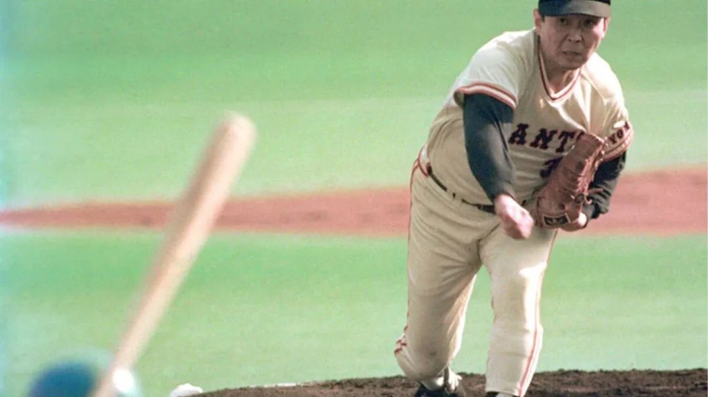
There are players who dominate their era, and then there are players who disrupt it.
Suguru Egawa did both.
He finished his career with 135 wins, a 3.02 ERA, and one of the most overpowering fastballs Japanese baseball had ever seen. He led the Central League in wins twice, strikeouts three times, ERA once, and in 1981 captured the pitching Triple Crown while carrying the Yomiuri Giants to a championship. At his peak, he was the best pitcher in Japan. Americans who saw him said he was as good as Nolan Ryan.
And yet, for much of his career, he was treated not as a hero but as a problem.
Egawa was called “Dirty Egawa” and was labeled “The Enemy of the People.” A verb—egawaru—entered the language, meaning to forcefully impose one’s opinion on others without regard for custom or consequence. Newspaper articles questioned his character. Fans booed him. Team executives worried he was changing baseball in the wrong direction. In hindsight, much of what angered people about Egawa now feels familiar: he managed his workload, he listened to his body, and he believed a career was something to steward, not sacrifice. The problem was timing: he was behaving like a modern athlete in a baseball culture that still worshiped obedience and working oneself to exhaustion.
Long before he was framed as selfish or ungrateful, Egawa had already been turned into something other than a person. As a high school pitcher at Sakushin Gakuin*, he was labeled Kaibutsu—the Monster. The nickname began half as a joke, borrowed from a popular manga character, inspired by his ears as much as his velocity. But it stuck, and it hardened. In an era without video highlights or instant replay, rumors traveled faster than proof. Somewhere in Tochigi Prefecture, people said, there was a teenage pitcher throwing a fastball so violent that bats barely grazed it. Egawa threw no-hitters and perfect games. He piled up strikeouts in numbers that sounded implausible. Fans reacted audibly when hitters merely made contact. For years, he hovered at the edge of the national stage, not quite reaching Koshien, the national high school baseball championship, which only added to the mystique. By the time he finally arrived, crowds were not watching a pitcher so much as a legend.
*New Astros pitcher, Tatsuya Imai, led Sakushin Gakuin to the Summer Koshien title in 2016.
But he never won a Koshien championship. His final high school game in the tournament ended in a rain-soaked walk-off loss. Even then, the Monster felt unfinished. That sense—that Egawa was always incomplete and never quite fulfilling his potential—would follow him for the rest of his career.
At Hosei University, Egawa refined himself. Surrounded by one of the most talent-rich eras in collegiate baseball, he learned to pace his power. He no longer tried to overpower every hitter. He learned restraint, timing, and how to reach back only when it mattered most. He won 47 games in Tokyo Big6 play and struck out 443 batters.
There is a story from his university days that explains more than any stat line. When Egawa had a date scheduled on a day he pitched, he didn’t give a time like everyone else. He said things like, “Meet me three hours after first pitch.” And if the game moved too quickly, he would deliberately waste a few pitches to slow the game down. He wanted the game to end when he said it would end.
No one doubted what he would become. What complicated everything was that Egawa wanted only one thing: to pitch for the Yomiuri Giants.
That simple and stubborn desire would reshape Japanese professional baseball.
What became known as the “Blank Day” affair has often been portrayed as a clever loophole exploited by an arrogant young pitcher. Years later, even Egawa would quietly correct that version. A 23-year-old, he admitted, did not invent this plan.
During his senior year at Hosei, he was selected by the Crown Light Lions with the first pick of the 1977 draft. He turned down the Lions at the urging of relatives who begged him to stay in Tokyo, to play for the Giants or at least a Central League team. The following year, just before returning from baseball study in the United States*, his father called him. “There’s a way to get into the Giants,” he said.
*At the time, the Lions were based in Kyushu, far away from Tokyo.
Egawa signed a surprise contract with the Giants on November 21st, 1978, the day before the draft, claiming that the Lions’ exclusive negotiating year had expired. The Giants agreed. The Central League did not. The league declared the contract invalid, but the Giants boycotted the draft the following day. Four teams drafted him anyway; Hanshin won his negotiating rights by lottery but the Giants refused to recognize Hanshin’s right to negotiate with Egawa.
Finally, under pressure from the commissioner, Egawa signed with Hanshin—then, the same day, was traded to the Giants for ace pitcher Shigeru Kobayashi.
If you want to understand why so many people reacted so harshly, you just have to see what they saw: Kobayashi, who had won the Sawamura Award in 1977, was suddenly recast as the tragic hero in Egawa’s story. Kobayashi was traded without warning, but did not complain. At a late-night press conference, he said he needed no sympathy. The public adored him for it.
Egawa was framed as selfish, cold, and ungrateful. Few asked how much control he had truly exercised and fewer noticed that he never celebrated the outcome. He had arrived where he wanted to be, but became a villain before he threw a pitch.
What offended people most wasn’t the maneuvering and rule bending—it was Egawa’s attitude. At his first Giants press conference, reporters shouted accusations before the press conference even began. When Egawa tried to calm the room—asking everyone not to get so excited—the words were clipped, replayed, and transformed into evidence of arrogance. In a culture that prized ritual humility, plain speech became another offense. “Don’t get excited” turned into a national punchline.
Egawa’s rookie season was delayed and uneasy. He finished 9-10. Kobayashi won 22 games and took home the 1979 Sawamura Award. The contrast was unavoidable. Then Egawa settled in. In 1980, he won 16 games and led the league in strikeouts. In 1981, everything came together: 20-6, a 2.29 ERA, 221 strikeouts, the pitching Triple Crown, league MVP, and a Japan Series championship in which he captured the final out himself.
The Sawamura Award went to someone else. It went to his teammate Takashi Nishimoto.
Nishimoto represented everything Egawa was supposed to be: tireless, durable, unquestioning. He threw more innings. He made more starts. He embodied the virtue Japanese baseball prized above all else: availability. Egawa never complained publicly. But from that moment on, Nishimoto became his measuring stick. They avoided eating together. They avoided joint interviews. From 1979 through 1987, Nishimoto never finished a season with more wins than Egawa. Even when Egawa’s shoulder began to fail, even when Nishimoto absorbed heavier workloads, Egawa stayed ahead.
If Nishimoto represented the path Egawa rejected, Masayuki Kakefu represented the opponent Egawa chose. Egawa never pitched around Kakefu. Not once. Kakefu was Hanshin’s cleanup hitter, the emotional center of the Tigers, and everything Giants fans feared. On one occasion, the bench signaled for an intentional walk. Egawa ignored it and threw his best fastball. Kakefu later said Egawa’s pitches did not simply beat swings; they passed above them, forcing hitters to rethink what a fastball could do.
Egawa hated avoidance. He hated walks. He believed pitching around a hitter was dishonest, not only to the batter, but to the crowd. Fans had come to see something decisive and he felt he owed them that. Against the bottom of the order, he saved his shoulder. Against the heart of the lineup, he emptied it.
When Randy Bass chased history in the mid-1980s, Egawa refused to pitch around him. Bass would later call Egawa the best pitcher he ever faced, in Japan or America.
But by his sixth season, the shoulder was beginning to fail him. Even in university, he pitched through pain. As a professional, he hid it carefully. When the pain returned for good, he was mocked as having a “hundred-pitch arm.” When his shoulder hurt, he rested. When it didn’t respond, he adjusted. To many, that looked like weakness. To others, it was baseball heresy.
Egawa still had flashes—like the 1984 All-Star Game where he struck out eight consecutive hitters and nearly broke the record of nine—but the strain was constant. On September 20, 1987, in Hiroshima, he took a one-run lead into the ninth inning. Two outs, no one on. The batter was Takehiko Kobayakawa. The catcher signaled for a curveball but Egawa shook him off. He threw his best fastball: elevated and down the middle. Kobayakawa hit it into the right-field stands for a walk-off home run. As Kobayakawa circled the bases, Egawa sank to his knees on the mound, unable to move.
He knew.
Egawa retired at 32, fresh off a 13-win season. Critics called it selfish. They said he quit too early. They said he should have pitched until his arm fell off. Egawa said his shoulder was done.
Years later, when he finally reconciled publicly with Kobayashi in a television commercial, Kobayashi said only this: “It was hard, wasn’t it? It was hard for both of us.”
For a long time, Suguru Egawa was framed as a villain who won too easily and left too soon. What he never did was perform suffering on demand. Suguru Egawa did not pitch until his arm fell off.
He stopped.
In the end, Suguru Egawa was less a rebel than a mirror. He reflected back to Japanese baseball the things it did not yet want to see: that exhaustion was not virtue, that loyalty could coexist with self-preservation, that excellence did not require ruin. The anger he provoked said less about his choices than about the fear of what those choices implied. By the time the game accepted those truths*, Egawa was already gone, carrying the weight of having been right too soon.
Thomas Love Seagull’s work can be found on his Substack Baseball in Japan
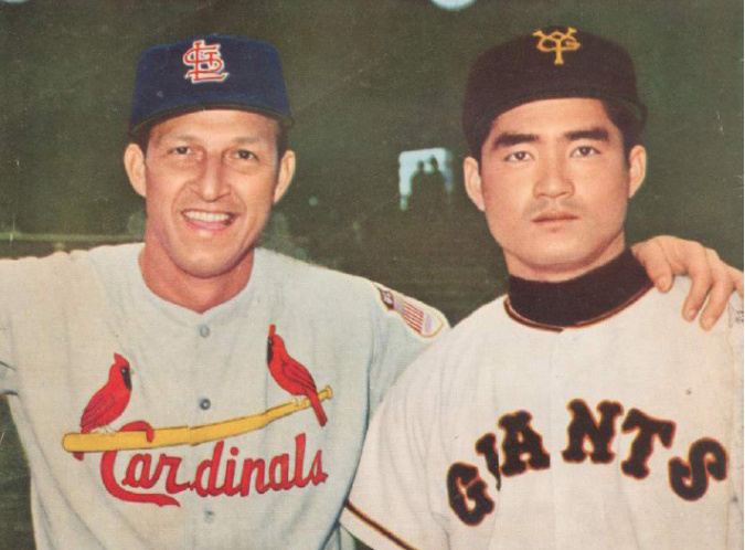
Every Monday morning we will post an article from SABR’s award-winning books Nichibei Yakyu: Volumes I and II. Each will present a different chapter in the long history of US-Japan baseball relations. This week Adam Berenbak focuses on Stan Musial, Shigeo Nagashima, and the Cardinals 1958 visit to Japan.
Game Seven of the 1958 Japan Series featured a winner-take-all finish to a classic contest between two storied franchises.
In the bottom of the ninth, with a six-run lead, 21-year-old Kazuhisa Inao stared down at Shigeo Nagashima, ready to wrap up one the most famous pitching feats in Japan Series history. He had earned the win in the previous three games for the Nishitetsu Lions and was prepared to win his fourth in a row, and with it the championship. With such a comfortable lead, Inao had little to worry about, even though he faced Nagashima, the star rookie of the Yomiuri Giants. The Rookie of the Year hit a high fly ball deep into Korakuen Stadium that the Lions center fielder couldn’t make a play on. Nagashima displayed his blazing speed and sailed around the bases for an inside-the-park home run. Inao then finished off the remaining Giants and took the crown.
Though Nagashima’s home run had little effect on the outcome of the game, the matchup represented the best of baseball in Japan and the future of the sport. At the same moment, roughly 680 miles (1,100 kilometers) away in Seoul, the St. Louis Cardinals were playing a Korean all-star team in preparation for a 16-game tour against Japan’s best. A few days later, they would face an all-star team built around Nagashima and Inao, assembled by tour sponsor Mainichi Shimbun and tour organizer Yetsuo Higa, to showcase the young talent that would be the future of Japanese baseball.
THE TOUR STARTS
To quote Jim Brosnan, who was splitting duties by pitching for the Cardinals and covering the tour for the St. Louis Post Dispatch, “From one of the longest runways in the world, San Francisco, we took off on the longest trip of this or any other year. By sunrise on the tenth we gained four hours changing time zones and explaining to the stomach wha’ hoppen [sic] in our 28-hour day.” The tour began in earnest the next day in front of a mere 3,000 fans at the Maui County Fairgrounds in Kahului, on the island of Maui. They faced a team that featured Bob Turley, Lew Burdette, and Eddie Mathews bolstering a collection of local ballplayers that Higa put together.
Two years before, Commissioner Ford Frick had helped arrange for the two major Japanese papers, Yomiuri Shimbun and Mainichi Shimbun, to host US tours, after each paper had tried to host teams in 1955. The solution was to alternate responsibility every other year, beginning with the 1956 Dodgers tour. Yomiuri had hosted first and it was no surprise that the Giants had played a big role. This time Higa, a Nisei businessman representing Mainichi, had arranged the tour to be unlike previous tours, pitting a Japanese all-star team against the Cardinals.
Although formidable, St. Louis was a team in transition. The Cardinals in 1958 had finished fifth in the National League. The only real highlights of the season were Stan Musial’s 3,000th hit and the debut of Curt Flood, who eventually helped the team to three pennants. Most of the team’s regulars made the trip, including Musial, Don Blasingame, Ken Boyer, Vinegar Bend Mizell, Wally Moon, Hal Smith, and Gene Green. However, last-minute substitutions, even after the vaccination shots had been administered, gave rise to a team that much more resembled the 1959 Cardinals. Gene Freese, Billy Muffett, and Hobie Landrith had already received their shots and clearances when they received trade notices just days before the team left. The 1958 coaching staff was set to go, too, but they were let go at the end of the season, two weeks after manager Fred Hutchinson received his pink slip.
Instead, newly minted Cardinals Alex Grammas, Bob Blaylock, and Ernie Broglio, along with brand- new manager Solly Hemus, made the trip. The pitching corps included Sam Jones, Mizell, Larry Jackson, and newcomers Blaylock and Broglio, the latter a promising rookie who was later (infamously) traded for Lou Brock. After tours by the San Francisco Seals in 1949 and all-star teams in 1951 and 1953, Japan had been visited by all three teams from New York. It was not shocking that the Cardinals were the third choice for 1958, behind the AL and NL pennant winners. Higa had made his play, but when major stars on both the Yanks and Braves decided against making the trip overseas, Higa was forced to reassess and offer the tour to St. Louis. His relationship with Cardinals, and the involvement of J.G. Taylor Spink, drove the decision, as well as an ability to exploit Musial’s stardom against an all-star team designed to showcase Japan’s youth.
Also along on the tour was Cardinals broadcaster Joe Garagiola. He was at the mike to broadcast a select number of games aired via tape-delay over KMOX Radio in St. Louis. The Sporting News claimed it was the first time a domestic radio station had broadcast baseball from overseas.
After the Kahului game, which the Cardinals took, 4 1, on Larry Jackson’s strong arm and his third-inning home run off Burdette, the two teams met twice in Honolulu. The Cardinals won the first game in a 9-1 rout, collecting six runs in five innings off Bob Turley, fresh off his historic Game Seven World Series win. St. Louis tacked on three more runs off Len Kasparovitch. The sole run for the Hawaiian All-Stars came when Ken Kimura drove in Wally Dupont, who had reached third when his base hit skipped past center fielder Bobby Gene Smith and rolled to the fence. In the final game, St. Louis edged the Hawaiian All-Stars, 5-4. Mathews tied the game, 4-4, with a home run off Broglio in the fourth, but two consecutive Hawaiian errors in the fifth allowed the Cardinals to regain the lead. The true star of the game was former Dartmouth pitcher Jimmy Doole, a schoolteacher who held the Cardinals to one hit during the final three innings. Strong seasonal rain forced the cancellation of a game in Guam, but otherwise the Cardinals soundly defeated the opposition in games at Manila and the Air Force Base in Kadena, Okinawa, before boarding the plane to Japan.
JAPAN
The touring group arrived in Tokyo on October 20 to a 1,500-person welcome party at Tokyo International Airport. In 13 open-topped cars, the team then paraded through streets packed with fans before arriving at the Imperial Hotel. They caught Game Six of the Japan Series and then set out on a two-day trip to South Korea to play before 25,000 fans in Seoul, including President Syngman Rhee. After they returned to Japan, there was a workout in Tokyo attended by nearly as many fans, before the real contests against the Japan All-Stars began on October 24 in a sold-out Korakuen Stadium, where the 1,200-yen seats were going for 10,000 yen on the side.
The Cardinals faced a formidable foe. The Mainichi newspaper distributed a supplement to advertise the tour that listed a Japanese roster that averaged just 24 years old—a whole generation of players coming into their own. Nankai Hawks ace Matsuo Minagawa was described as “specializing in terrific shoots,” an ode to his side-arm screwball, which, along with his slider, baffled hitters into the late 1960s. He was one of the 23 future Japanese Hall of Famers on the squad,joining several players not bom in Japan, like the Cuban Roberto “Chico” Barbon and Bill Nishida, a Nisei born in Hawaii. But it was Shigeo Nagashima who was the real sensation of Nippon Professional Baseball and would be “the most watched player in the coming series against the Cardinals.” He was already a “national hero,” even before joining the Giants due to his turning Rikkyo University into champions. Nagashima signed the largest contract for a rookie in Japanese history (to that date) and came through with a spectacular performance, leading the Central League in home runs and winning the Rookie of the Year Award. As the series got under way, Nagashima was praised by both Japanese and touring Cardinals as being a “major-league third baseman.” Besides Nagashima, the young All-Stars included Futoshi Nakanishi, Tatsuro Hirooka, and Katsuya Nomura, as well as aces Inao, Tadashi Sugiura, Takao Kajimoto, Motoshi Fujita, and 20-year-old Tetsuya Yoneda.Added to that core was one of the best pitchers in the history of the game, Japan’s only 400-game winner, Masaichi Kaneda, who was already well known to US fans as the man who had struck out Mickey Mantle three times in the second game of the Yankees’ 1955 tour. These players formed the core of Japanese baseball for the next decade as the sport moved into its own, with Nagashima at its center, epitomizing both youth and progress.
With the stadium full and the cameras broadcasting across Japan, the tour was underway. The Cardinals took the game, 5-2, but the star of the day was Nagashima, who hit a home run in a game that saw no homers from the Americans. Stan Musial went hitless. The two All-Star runs came on home runs by Nagashima and Chunichi Dragons sure-hitting second baseman Noboru Inoue. Mizell got the win thanks to Don Blasingame, who notched three hits off Tetsuya Yoneda and Masaaki Koyama.
The next day’s game featured a start by Kazuhisa Inao, who did not pitch in the first game, possibly because he needed rest after his recent performance in the Japan Series. Inao, in his third full season, had attained a superhuman veneer after capturing all four of the Lions’ wins in the Japan Series. The press referred to him as the “Iron Man” and “Superman.”The sellout crowd, including Foreign Minister Aiichiro Fujiyama, who threw out the first pitch, appeared thin due to a steady rain that eventually led to the game’s premature end. Nonetheless, countless fans cheered on the All-Star team from home on television.
The rain started falling in the second inning, which saw Inao, along with Nishita and future Hall of Famer Takao Kajimoto, give up 13 hits over six innings to lose 8-2. The Cardinals broke out in the fourth, knocking in four runs, all off Inao, who gave up seven hits. Larry Jackson pitched six innings, giving up four hits—though one was a 390-foot homer off Nakanishi’s bat. The driving rain eventually forced the umpires to call the game at the end of six innings.
About 185 miles (300 kilometers) away in Sendai on October 27, the All-Stars won their first game, as Kazuhisa Inao showed off his ironman stuff. Coming back on only two days’ rest, Inao pitched three innings in a relief to grab the win after southpaw Atsushi Aramaki had allowed the Cardinals to knot the game, 2-2, in the top of the seventh. In the bottom of the seventh, the Japanese surged ahead on “three walks, a wild pitch, a sacrifice bunt and two costly errors for four runs” to win, 6-3.
The tour then moved to Sapporo, where on October 28, before 30,000 fans, the Cardinals won 9-1. Blaylock pitched a brilliant seven-inning stretch, giving up only an inside-the-park homer to Nagashima along with one other hit. Two days later, the Cardinals won another behind Bobby Smith’s two doubles, a single, and a homer, just barely missing the cycle. However, Smith didn’t leave the stadium without claiming one—he was awarded a motorcycle as MVP of the game, and then proceeded to drive around the infield as the crowd cheered him on. The Cardinals won again, 7-2, in Nagoya before another game scheduled for November 1 in Osaka was rained out. On November 2 the Cardinals faced Aramaki in Nishinomiya. Aramaki held the Americans to one run in five innings before being removed for a pinch-hitter. Inao came in but the Cardinals scored three in the seventh and won handily 6-1.
According to The Sporting News, the “Cardinals were in formal dress more than baseball flannels” as they moved from party to party, highlighted by an audience with Prime Minister Nobusuke Kishi and Ambassador Douglas MacArthur II (the general’s nephew).
The tour’s largest crowd showed up at Koshien Stadium on November 3. Each August, Koshien is home to the National High School Championship, which, along with the spring invitational, showcases the future of Japanese baseball. The 1957 tournament had featured a legendary performance by Sadaharu Oh, and the August 1958 tournament had seen the first team from Okinawa to participate—a great step forward in the relationship between the occupied island and mainland Japan. Before the game, a home run contest was held. Shigeo Nagashima paced the All-Stars with seven home runs, matched only by Musial. In the end, the All-Stars eked out a 15-14 victory, though the crowd cheered each and every dinger, proving the old adage “you can’t boo a home run.” Before roughly 50,000 energized fans at Koshien, Masaaki Koyama pitched brilliantly over eight innings holding the Cardinals to two runs. Ken Boyer proved to be the heavy hitter, tying the game in the ninth with a home run and then winning it in the 10th by driving in Blasingame.
Sitting in the crowd that day was Haruki Murakami. The future award-winning writer recalled:
When I was nine, in the fall, the St. Louis Cardinals played a goodwill game against an All-Star Japanese team. The great Stan Musial was at his peak then, and he faced two top Japanese pitchers, Kazuhisa Inao and Tadashi Sugiura, in an amazing showdown. My father and I went to Koshien Stadium to see the game. We were in the infield seats along first base, near the front. Before the game began, the Cardinals’ players made a circuit of the whole stadium, tossing signed soft rubber tennis balls to the crowd. People leapt to their feet, shouting, vying to grab the balls. But I just sat in my seat, vacantly watching all of this happen. I figured that a little kid like me had no chance of getting one of those signed balls. The next instant, however, I suddenly found one of them in my lap. By total chance, it just happened to land there. Plop—like some divine revelation.
“Good for you,” my father told me. He sounded half shocked, half admiring. Come to think of it, when I became a novelist at age thirty, he said almost the same thing to me. Half shock, half admiration. That was probably the greatest, most memorable thing that happened to me when I was a boy. Maybe the most blessed event I ever experienced. Could it be that my love for baseball stadiums sprang from this incident? I took that treasured white ball back home, of course, but that’s all I remember about it. What ever happened to that ball? Where could it have possibly gone?
The second game in Osaka saw half the crowd but provided twice the thrill as the Japanese All-Stars punished the Cardinals for their second win of the series. Futoshi Nakanishi, whom the Cardinals nicknamed “Big Buffalo,” hit a grand slam after Blaylock loaded the bases in the fourth inning, and added a two-run double in the sixth off Brosnan, driving in six of the All-Stars’ nine runs. “Too much Buffalo,” quipped Cardinals manager Solly Hemus after the game. Tadashi Sugiura allowed two runs over nine innings to earn the victory.
The home-run derby wasn’t the only exhibition that Mainichi had planned for the tour’s stop in Osaka. At their broadcast studio, the paper arranged for four members of each team, including Nakanishi and Brosnan, to participate in a singing contest live on- air.Joe Garagiola taped the contest for future broadcast and referred to it as “the highlight of the whole tour.” Brosnan noted that the real entertainment was the lack of musical talent among professional ballplayers, and there was a general sense of teasing and self-deprecation.
While the broadcast ended up a fun goodwill gesture, in the vein of so many vaudeville appearances by pro ballplayers dating back nearly a century, an undercurrent of racial insensitivity by poking fun at cross-cultural differences persisted in other aspects of the tour. The American press often contained racially insensitive terms, images, and innuendos. The St. Louis Post-Dispatch mocked stereotypical Japanese English with the headline “So-Sorry Cards Make Sad Sam at Home in Japan, Boot Game.” The Sporting News ran cartoons featuring buck-toothed and squinty- eyed Japanese fans—a style now called yellowface that was commonly used in American propaganda during World War II. Even Garagiola at times expressed a giddy fondness for poking fun at cultural differences, such as insensitive quips about how bowing was just a way for businessmen to check the size of your bankroll.
National League Secretary-Treasurer Fred Fleig proclaimed that the Japanese All-Stars were the equivalent of Triple-A players and that they lacked “quick judgment and alertness for unexpected situations.” He praised Koshien Stadium as ranking with Yankee Stadium and Municipal Stadium. His comments reflected the patronizing and racially insensitive viewpoints of many in the US traveling party and press in postwar Japan. These evolving racial and national identities exemplify both countries at a crossroads, as the prejudices of the Second World War era evolved into the coming challenges of the 1960s. Though toned down from the racist rhetoric of previous times, it was still problematic. This in turn was juxtaposed with the team’s solemn visit to Hiroshima.
On November 6 the teams went to Hiroshima and were greeted by Mayor Tadao Watanabe and a flower-throwing crowd in front of the Hotel New Hiroshima. Before the game, Musial and Hemus held a baseball clinic at the American Cultural Center for 250 Japanese players and fans. Before 20,000 excited fans, Atsushi Aramaki faced Ernie Broglio, who pitched a complete game despite two first-inning wild pitches that led to a run. The Cardinals hit Aramaki hard, going ahead 6-1 in the top of the sixth inning. Once again it was the rookie Nagashima who provided the punch for the All-Stars. After Kenjiro Tamiya reached base in the bottom of the ninth, Nagashima patiently waited for his pitch before hitting a 3-and-2 meatball over the left-field stands. However, it wasn’t enough, and the All-Stars fell, 6-3.
Earlier in the day, the American visitors had visited the Memorial Monument for Hiroshima and placed floral bouquets at the base of the arch. Then the club physician, Dr. L.C. Middleman, trainer Bob Bauman, coach Johnny Keane, and players Don Blasingame and Alex Grammas visited the 72 patients at the Hiroshima Atomic-Bomb Survivors Hospital signing autographs and offering kind words. Solly Hemus kept a video diary of the trip to Hiroshima, but his camera was stolen from the dugout during pregame ceremonies. Before he returned home, local fan Tsutomu Hayashi presented Hemus with a gift of over 150 feet of footage taken in Hiroshima, “in the interest of better US-Japan relations.”
The next day an earthquake hit while the team was waiting for a train to Fukuoka, but the players did not feel the tremors. At Heiwadai Stadium on November 8, Bishop Seiemon Fukahori of the Fukuoka Catholic Church, presented the Cardinals with a silk pennant embroidered with the team’s logo. This was a thank-you from leprosy patients at the Biwasaki Leprosarium, who were expressing their gratitude for Christmas gifts the Cardinals sent to the hospital in 1941. Attendance up to this point was 338,000 in addition to the millions who tuned in at home. Stan Musial had knocked out 12 hits for a .324 average—however, he had yet to smack a home run. (Some of the Cardinals players complained that the Japanese balls used during the tour were dead.) Meanwhile Nagashima had three, in addition to his seven from the home-run contest. Fukuoka fans came out to Heiwadai Stadium 30,000 strong on November 8, cheering Cardinals starter Phil Paine, who had pitched for the Nishitetsu Lions for a few games in 1953 while he served with the US Fifth Infantry Division stationed at Camp Drake in Fukuoka. The crowd saw him pitch out of a jam in the first by striking out Nakanishi, and then witnessed Musial finally slam his first home run, as the Cardinals won 5-1.
After a 7-1 St. Louis victory in Shimonoseki, Broglio then nearly no-hit the All-Stars the next game, played three days later in Shizuoka. Supported by home runs from Wally Moon and Gene Green and 15 hits off Sugiura, Zenjiro Tadokoro, and Hiroomi Oyane, Broglio held the All-Stars hitless for 6⅔ innings. With two outs in the seventh, Kenjiro Tamiya eked out a single for Japan’s only hit of the afternoon. Sam Jones finished it off with two hitless innings to hand the All-Stars their only shutout of the tour.
HOME
The last game before heading back to Tokyo was played in Mito on November 13. Masayuki Dobashi started for All-Japan but was relieved in the fifth by Bill Nishita, the Nisei who had played on and off in Japan since joining Yomiuri in 1952. Nishita pitched in the International League, the American Association, and the Pacific Coast League, as well as in the Central and Pacific Leagues in Japan, and with UC Berkeley—a true journeyman. The Cardinals won 5-1, thanks to Blasingame, who repeated his four-hit day from November 9, and also Gene Green, who homered twice. Green’s good fortune continued into the trip home and December, when he married St. Louis model Mari-Frances Rosenthal, a match The Sporting News dubbed a “wedding of blond and blond.”
It was back to Tokyo on the next to last day of the tour, in front of 20,000 shivering fans at Korakuen Stadium. Though they were treated to a 400-foot, two-run homer off the bat of Nakanishi, the Cardinals eventually walked away with the game, 9-2, as they racked up 16 hits. Blasingame nearly hit for the cycle: After hitting a single and triple, he homered to deep center off Tetsuya Yoneda.
November 16 marked the final day of the tour. A doubleheader at Korakuen Stadium attracted 80,000 fans. In the morning Takashi Suzuki faced off against Sam Jones. A pair of solo home runs by Green highlighted the 8-2 victory for the Cardinals. In the second game Japan was up 2-0 in the sixth when Boyer homered off Inao to cut the lead in half. The Cardinals took the lead in the seventh behind Lee Tate’s two-run double and another Boyer RBI. This brought the tour to a close with 14 wins for the Cardinals against only two wins for the Japan All-Stars, bucking the prediction by “Japanese baseball experts” that the Cardinals would match the 1956 Dodgers and lose four or five games. Yet each game was a display of the young talent in the Japanese game, and an affirmation that the Japanese were becoming strong enough to complete with talent from the major leagues. Nagashima lived up to the hype and was awarded the trophy as MVP of the Japanese team, which was donated by J.G. Taylor Spink. In the eyes of many Giants fans, Nagashima would be the heart of a Yomiuri team that announced during the tour that it would no longer sign foreign players, stating, “Japanese baseball should be played by Japanese players.”
Stan Musial hung on for a few more seasons, but it was a new generation of players who would take St. Louis to heights in the 1960s. And despite Yomiuri’s announcement that it would no longer recruit foreign players, other teams leapt at the chance. During the trip, three Cardinals pitchers—Phil Paine, Bill Wight, and Jim Brosnan—were even offered contracts to pitch in Japan during the 1959 season. All three declined, though only Brosnan was still officially a Cardinal after Wight was released and Paine demoted in the middle of the tour. Don Blasingame’s performance over the course of the tour cemented his visage in the minds of Japanese fans, and was the start of a long-lasting relationship between him and Japan. He would spend a decade and a half playing, coaching, and managing in Japan after a long major-league career.
Though the Cardinals seemed to represent the end of an era, the young talent represented in the Japanese All-Star team signaled a new beginning. The 1958 tour was at the crossroads of postwar bridge-building, straddling the end of the American occupation with the 1960s and beyond. Wally Yonamine made way for Sadaharu Oh, who joined the Giants in 1959, creating the “Oh-Nagashima Cannon” that drove the golden era of baseball in Japan. Sugiura, another rookie in 1958, won both Pacific League MVP and Japan Series MVP honors in 1959 on his way to a Hall of Fame career. And though Inao would not win another MVP after his back-to-back awards in 1957 and 1958, he won 30 games in 1959 and continued to dominate batters in Japan for the next decade. The tours of Japan that followed continued to strengthen the relationship between the two countries and their baseball leagues. When Ichiro is inducted into Cooperstown, he will have players like Nagashima and Blasingame in his baseball DNA, as well as the strong bonds engendered by 1958’s new direction.
Continue to read the full article on the SABR website
The SABR Asian Baseball Research Committee is excited to host Bill Plunkett in a discussion about Shohei Ohtani and his book L.A. Story: Shohei Ohtani, The Los Angeles Dodgers, And A Season For The Ages. Please join us for a general discussion about Shohei! Signup for this exciting zoom event below:
Bill Plunkett covers the Dodgers beat for the Orange County Register, and has written about baseball in Southern California for nearly 25 years, including a separate stint on the Angels beat. His work has appeared in Baseball America and Baseball Digest, and, and he is a frequent guest on MLB Network, ESPN, and SportsNet LA.
Asian Baseball Committee meeting
When: Feb 19, 2026 09:00 PM Eastern Time (US and Canada)
The baseball film Moneyball depicts a moment when one club tried to understand baseball in a completely different way. The 2002 Oakland Athletics questioned the conventional wisdom that permeated the baseball world. By acquiring undervalued players through sabermetrics, they redesigned their team. Similar attempts did not appear only in the United States.
In Korean baseball history, the 1990s were a time when even the word “data” was unfamiliar. Even in this environment, there were people who questioned an operating style that relied on intuition. The starting point was not a front office meeting or a research report. It was a single book written by a baseball fan.
Lotte at the end of the 1980s, having lost its direction
In the late 1980s, Korean professional baseball still remained a “people’s game.” A manager’s experience and instincts, trust in veteran players, and internal organizational inertia were the standards for team operations. When results were bad, the manager was replaced, and when momentum was good, existing methods were maintained. Long term development and structural reform were always pushed to the back. The Lotte Giants, who finished last in 1989 and stayed in the lower ranks in 1990, were likewise a team that had lost its way amid this inertia. The fandom was overwhelming, but the team had no explanation for why it was losing.
A perspective formed outside baseball
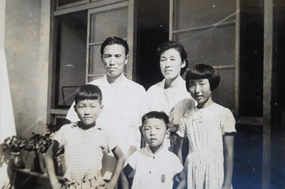
Around this time, there was one person who looked at the team from a completely different angle. His name was Jeong-gyu Song. He was born in Busan and studied at Korea Maritime University, which trains navigators. He then began his career as a deck officer on merchant ships. Later, he was promoted to captain at a U.S. shipping company, making the sea his workplace. Baseball was not his profession, but his interest ran deep.
Baseball fan Jeong-gyu Song (front center), who chose the path of a navigator under the influence of his father, a professor at Korea Maritime University
Long voyages gave him time to study baseball. Through Japanese professional baseball newspapers, American sports magazines, and Major League related books, he naturally came to place Korean baseball alongside overseas baseball and compare their structures. The differences became increasingly clear. At the time, player usage in Korean baseball relied excessively on intuition, and team management lacked a consistent philosophy. There was no system to systematically develop prospects, and responsibility for poor performance always fell on the field staff. Jeong-gyu Song began recording and accumulating the problems he felt while thinking about the Lotte Giants.
Choosing records instead of protests
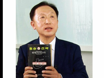
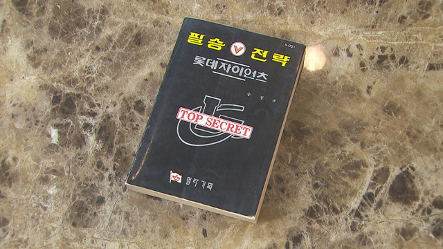
Jeong-gyu Song did not initially intend to write a book. He called the club several times to explain the team’s problems. However, the opinions of an “ordinary fan” were repeatedly brushed aside. Deciding that conveying things verbally no longer worked, he chose to organize his thoughts and leave them as a written record. After seven months, during which he even set up his own publishing company, The Winning Formula: Lotte Giants’ Top Secret was released into the world.
A book that is still talked about among Korean baseball fans today
It was self published, and sales were not high. However, the contents were concrete. The role of the front office, standards for player usage, and the necessity of a long term development system were organized by topic. From today’s perspective, these are not unfamiliar ideas, but at the time they were novel problem statements in Korean baseball. The book gradually spread by word of mouth. Unexpectedly, it reached the hands of Lotte owner Jun-ho Shin.
Becoming a general manager with a single book
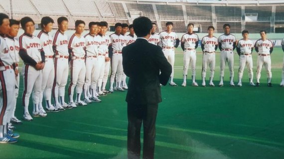
In 1991, the Lotte Giants made a radical choice. Jeong-gyu Song was appointed general manager. Former sailor, late 30s, no practical experience in baseball team operations. In the front office culture of the time, it was a highly unusual appointment. Internal reactions were cold. Open turf battles and exclusion followed, and there were even times when, because budget cooperation was not provided, he had to go out personally to look for sponsors.
Jeong-gyu Song greeting the players after taking office
His operating philosophy was also different. He spoke about statistical analysis, the strong number two hitter theory, and the need for a development system. Concepts that are familiar now were met then with reactions like “that sounds like baseball comics.” However, change quickly appeared in results. In his first year, 1991, Lotte rose to fourth place and advanced to the postseason. They surpassed one million spectators in a single season for the first time in professional baseball history. In 1992, they even won the Korean Series.
The experiment ended, but the questions remained
The championship was not the end. Internal conflicts still remained. An assessment arose that he “damaged organizational harmony.” This evaluation was reported to club management. Jeong-gyu Song, who encountered this while on his honeymoon, resigned voluntarily after returning home. Since then, Lotte has gone more than 30 years without another championship.
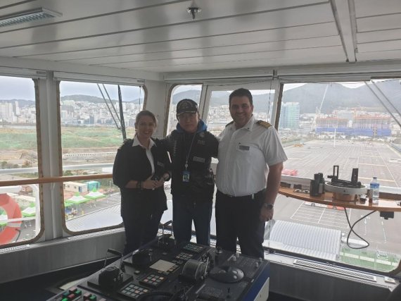
He is also known as Korea’s top expert in the field of maritime economics, combining practice and theory
He returned to the shipping industry. Afterward, he continued working in key positions in shipping and port related organizations. Even after mandatory retirement, he has continued to advise on and contribute to major issues in Korea’s shipping and port sectors. His distance from baseball grew, but his perspective remained sharp. In 2024, he appeared on a Busan regional radio broadcast and became a topic of conversation again after predicting Lotte’s preseason ranking with considerable accuracy. Decades have passed, but he left the impression that his eye for the team had not changed.
The Winning Formula: Lotte Giants’ Top Secret is now an out of print book. Rather than a theoretical text, it is closer to a record of one fan asking questions and working through the answers. Attempts similar to Moneyball clearly existed in Korean baseball as well. However, they did not take root as a successful management strategy, nor did they expand into a popular narrative. Even so, this attempt showed a brief but meaningful possibility in Korean baseball.
A recent poll for a TV special saw more than 50,000 people in Japan vote for their favorite retired baseball players. 20 players emerged from a pool of 9,000. Yes, they could only vote for players who are no longer active, so you won’t see Shohei Ohtani or other current stars on this list. Which is probably smart because I’m sure Ohtani would win by default. There are, however, players who were beloved but not necessarily brilliant, and foreign stars who found success after coming to NPB. Unsurprisingly, the list leans heavily towards the past 30 years, with a few legends thrown in for good measure.
Over the next few weeks, I’ll be profiling each of these players. Some of these players I know only a little about, so this will be as much a journey for me as, hopefully, it will be for you. It’ll be a mix of history, stats, and whatever interesting stories I can dig up.
For now, have a look at the list below and see how the public ranked them. I’ve included the years they played in NPB in parentheses.
It just might be something far less glamorous: showing up, every day, with the same seriousness, for a very long time.
Takashi Toritani did that better than almost anyone who ever played the game in the history of Japanese professional baseball.
From 2004 to 2019, Toritani was the Hanshin Tigers’ shortstop (and later third baseman and second baseman) in the way a metronome keeps time. He didn’t announce himself. He didn’t demand attention. He was simply there—day after day, inning after inning, season after season—until the routine itself became historic.
If you were trying to explain his career in one sentence (and that is never a fair thing to do) it might sound something like this: he was always there. Not occasionally. Not usually. Always.
He was there for 1,939 consecutive NPB games.
He was there for 13 straight seasons without missing a single game.
He was there through position changes, through declining numbers, through pain that would have sent many others quietly to the bench.
And because he was always there, his career slowly accumulated into something enormous.
That sentence, though, suggests inevitability. It suggests iron. The truth was far more messy.
Toritani grew up in western Tokyo and learned balance before he learned baseball, excelling in judo as a boy. He was naturally left-handed, corrected to the right by a father who believed reliance was weakness, then nudged back toward the left by a coach who noticed what wouldn’t go away. Even early, his life in sports was shaped not by insistence, but by adjustment.
In junior high school, severe knee pain nearly ended everything. He planned to quit. He didn’t. He watched practice before he joined in again. He learned to wait.
What’s often missed is that this intensity was not always there. Toritani has said that he didn’t truly decide to become a professional until he reached university. Before that, baseball was something he loved among many things. He played because it was fun.
Then the goal became clear.
From that point on, he stripped his life down. When he wasn’t eating or sleeping, he thought about baseball. Not because anyone demanded it, but because he chose it. Reliability, for Toritani, was not a gift. It was a decision he made and kept honoring.
At Seibo Gakuen High School the climb was steady, not spectacular.
At Waseda University it became unmistakable. He started immediately. He never left the lineup. He won a Triple Crown early, struggled later, recalibrated. He stripped his dorm room of distractions, trained obsessively, and studied movement with near-scientific devotion. Coaches trusted him because he removed anxiety: he would be there tomorrow.
When the Hanshin Tigers drafted him in 2003, other teams wanted him. Toritani chose dirt infields over money and certainty over glamour. The choice fit.
His rookie year was uneven—starts, demotions, survival. By 2005, survival turned into permanence. He played every game, became the everyday shortstop, and helped Hanshin win the league pennant. Rhythm took over.
Shortstop is baseball’s truth serum. It exposes everything—range, hands, footwork, instincts, concentration. And it is merciless with age. Most shortstops don’t leave the position on their own terms. The position leaves them.
Toritani resisted longer than almost anyone.
Managers trusted him. Pitchers relied on him. Advanced metrics agreed.
Calm, it turns out, is a measurable skill.
At the plate, Toritani’s greatness came from something even rarer than power: refusal.
He did not chase pitches. He did not guess. Most importantly, he did not negotiate with pitches he didn’t believe in. That stubbornness was trained deliberately. Even in practice, he would not swing at a pitch he judged to be a ball, even if the batting-practice pitcher threw it, even if an umpire might have called it a strike. He trusted his own definition more than authority.
A thousand walks came from that belief.
When Toritani reached 1,000 career walks, he did so without the usual resume of power. Few home runs. Very few intentional walks. Pitchers weren’t avoiding him. They were pitching to him and losing the battle.
In 2011, during an era when offense collapsed across the league, Toritani led the Central League in on-base percentage. Hits were scarce. He simply found another way to help his team win.
That was another gift of his: adaptation.
And yes, sometimes he drove in runs.
In 2010, as a shortstop, he drove in 104 of them—a number that still feels slightly unreal for baseball in Japan. Shortstops are supposed to connect lineups, not carry them. Toritani didn’t chase power or reinvent himself. He used bat control, favored the left side, and let situations dictate his swings. The runs accumulated quietly.
In Nishinomiya, for a franchise defined by noise and emotion, Toritani was the stabilizer.
When Toritani reached 2,000 hits, it did not come quietly. On September 8, 2017, at Koshien Stadium, he lined a pitch into the right-center gap, stopped at second base, removed his helmet, and stood there while the crowd applauded. A former college teammate, Hiroyasu Tanaka, crossed the field to hand him flowers. Toritani smiled.
Later, he said the hit he remembered most wasn’t that one.
It was the first.
Two thousand hits were not a destination. They were the result of showing up every day and letting time do the work.
Earlier that season, a fastball had broken his nose. He returned the next night wearing a face guard and swung anyway. He made outs. He fouled pitches off. He stayed in the game.
People called him an Iron Man, and the streak justified the name. But “Iron Man” suggests invincibility, and Toritani was never that.
They also called him the Indomitable Man, which comes closer to the truth.
He played through broken bones—back, ribs, face. He returned without ceremony. The streak survived not because he was never hurt, but because he kept playing anyway.
Asked why, Toritani didn’t talk about records. He talked about responsibility. About fans who might only come to the ballpark that day. About the real fear that missing time could cost him his position. Over time, the streak itself became a reason to keep going.
When the streak finally stopped, it did so without ceremony. He began the game on the bench, never entered, watched a 1-0 loss pass quietly, and afterward said only that consecutive games always end someday, offering thanks not for the record itself, but for the managers who had kept writing his name into the lineup.
He knew that, eventually, time would demand compromise.
The range faded. The metrics dipped. Positions changed. Shortstop gave way to third base, then second, and finally the bench.
Toritani accepted all of it.
But when he became a part-time player, something unfamiliar happened. For the first time in his baseball life, he admitted he didn’t know how to prepare. He had always been a player whose value emerged over days, weeks, seasons. Reduce him to one at-bat, one moment, and the map disappeared.
And yet, the instinct never left.
Toritani once said that when he first turned professional, he set a simple, stubborn goal: to be ready to play shortstop at 40. Not to start. Not to be promised anything. Just to be ready.
“I’m not someone who gets lost thinking about life,” he said. “I deal with what’s in front of me.”
When Hanshin moved on, it wasn’t cruel. It was baseball. He finished the season anyway. He played shortstop one last time. He left with more than 2,000 hits, more than 1,000 walks, and a legacy defined not by moments, but by continuity.
Then came winter. Silence. And finally, a call from the Chiba Lotte Marines.
The role was small. The salary was modest. The number 00. He ran as a pinch runner, slid headfirst to score a walk-off run, played every infield position (including first base for the first time) and quietly set a national record* for games played at shortstop in a uniform few associated with him.
*A record since broken by Hayato Sakamoto.
At nearly 40, he was an Opening Day shortstop again. He returned to Koshien as a visitor and lined a pinch-hit RBI, drawing applause from both sides. Eventually even judgment and pain tolerance yielded. He retired. At the press conference, he didn’t linger on numbers. He said thank you.
Looking back, Toritani said the most dangerous moment in a career is the instant a player believes a dream has already been fulfilled. His own great ambition had once been the major leagues, and when that passed, he replaced it with new goals guided by a phrase he had carried since childhood: don’t see a crisis as a pinch, see it as a chance.
The day after his 2,000th hit, Toritani recorded his 2,001st.
It was a walk-off home run.
But that hit was never the point.
The point was everything that came before it: the pitches not swung at, the ground balls converted into outs, the days answered with a quiet yes.
He was always there.
Thomas Love Seagull’s work can be found on his Substack Baseball in Japan
Every Monday morning we will post an article from SABR’s award-winning books Nichibei Yakyu: Volumes I and II. Each will present a different chapter in the long history of US-Japan baseball relations. This week Rob Fitts focuses on the Brooklyn Dodgers 1956 tour of Japan where Jackie Robinson played his final game.
The Brooklyn Dodgers straggled into Idlewild Airport in Jamaica, Queens, on the morning of October 11, 1956. It had been a long, grueling season, ending the day before with a 9-0 shellacking by the Yankees in the seventh game of the World Series. Now, less than 18 hours later, the Dodgers were leaving for a four- week goodwill tour of Japan.
The subdued party of 60 consisted of club officials, players, family members, and an umpire. Although participation was voluntary, most of the team’s top players had decided to take advantage of the $3,000 bonus that came with the all-expenses-paid trip.1 Noticeably absent were Sandy Koufax, who was sharpening his game in Puerto Rico; Sandy Amoros, who was playing in Cuba; and World War II vet Carl Furillo who proclaimed, “I want no part of it. I’ve seen Japan once and there’s nothing there I want to see again.”2
As they readied to board the private flight to Los Angeles, Don Newcombe and his wife were missing. The Dodgers ace had won 27 games during the season and would win both the National League Most Valuable Player and Cy Young Awards. But he had failed spectacularly in the World Series, getting knocked out in the second inning of Game Two, and in the fourth inning of Game Seven. When asked about the up-coming trip after the Game Seven loss, Newcombe snapped, “Nuts to the trip to Japan!” “There’ll be trouble if he’s not on that plane!” countered Dodgers General Manager Buzzie Bavasi.3
Just after 11 A.M. the big pitcher arrived at the airport without wife or luggage. “The Tiger is here!” he announced as he boarded. He had spent the morning at the Brooklyn Courthouse to answer a summons on an assault charge for punching a parking attendant who had made a wisecrack about his Game Two performance. The plane left on time and after a stop in Los Angeles arrived in Honolulu at 5:30 P.M. on October 12.4
The Dodgers spent five days in Hawaii, attending banquets, sightseeing, sunbathing on Waikiki Beach, and playing three games against local semipro teams. As expected, Brooklyn won the first two contests comfortably, beating the Maui All-Stars, 6-0, behind 20-year-old Don Drysdale’s seven perfect innings on October 13 and the Hawaii Milwaukee All-Stars, 19-0, the next day. On the 15th, Don Newcombe took the mound against the Hawaii Red Sox. Spectators serenaded him with boos and jeers as the Red Sox scored three times in the second inning and chased him from the game in the fourth. “I can’t believe that I am still the target for abuse after getting 5,000 miles away from Brooklyn. I never want to come back here again! I didn’t want to make this trip in the first place,” he complained after Brooklyn pulled out a 7-3 win in the 10th inning. “This abuse thing has me worried,” he added. “I am afraid the emotional effect might continue to grow and become a detriment to my future career.”5 After a day of sightseeing, the Dodgers left for Japan on a 10 P.M. overnight flight.
The plane touched down at Tokyo’s Haneda Airport at 3:25 P.M. the following day, five hours behind schedule after mechanical trouble forced a seemingly endless stopover on Wake Island. A light rain fell from the gray sky. The weary players trudged off the plane and down the metal stairs to the tarmac where they were greeted by the first group of dignitaries and reporters. “Man, we’re beat,” Jackie Robinson complained as he left the plane. “We are all very tired,” Duke Snider added, “but we’re glad to be here. If we have a chance to shower and clean up, we’ll feel much better.”6
Japanese dignitaries and 40 kimono-clad actresses, bearing bouquets of flowers, welcomed the Dodgers as a crowd of fans waved from the airport’s spectator ramp. During a brief press conference, team owner Walter O’Malley proclaimed that “his players would play their best … and hoped that the visit would contribute to Japanese-American friendship.” “We hope to give the Japanese fans some thrills,” said Robinson.7
Despite the delay and relentless drizzle, thousands of flag-waving fans lined the 12-mile route from Haneda Airport to downtown Tokyo. Although many of the players longed for a shower, a warm meal, and a soft bed, they would not see their hotel for hours. After a brief stop at the Yomiuri newspaper’s headquarters, the team went straight to a reception at the famous Chinzanso restaurant. As they arrived, the hosts presented each visitor with a happi coat made to resemble a Dodgers warmup jacket and a hachimaki (traditional headband). Dressed in their new garb, the Dodgers mingled with baseball officials, diplomats, and Japanese ballplayers for several hours. Exhausted, the Dodgers finally checked into the Imperial Hotel around 9 P.M. Some of the younger players, however, went back out, attending “a giddy round of parties” before staggering back to the hotel in the wee hours of the morning.8
Fred Kipp, Gil Hodges, Wally Yonamine, Vin Scully, Roy Campanella and Don Demeter at the October 18 reception at Chinzanso, Tokyo. (Rob Fitts Collection)
Weary from the trip and the late night, the players struggled to get out of bed the next morning for the opening game against the Yomiuri Giants at Korakuen Stadium. Ceremonies began at 1 P.M. with the two teams parading onto the field in parallel lines behind a pair of young women clad in fashionable business suits. Each woman held a large sign topped with balloons, bearing the team’s name in Japanese. As the Giants marched on the field, some of the Dodgers gaped in surprise. “We went over there with typical American misconceptions,” Vin Scully later wrote. “We expected the local teams to be stocked with little yellow, bucktooth men wearing thick eyeglasses. When they first walked onto the field in Tokyo, I heard one of our players yell, ‘Hey fellas, we’ve been mousetrapped!’ One of the first ballplayers out of the dugout was a pitcher who was six feet four. … They averaged five feet ten or so, and they were all built like athletes.”9
Like the Dodgers, the Yomiuri Giants had just finished an exhausting season topped with a defeat in the Japan Series two days earlier. The Japan Timesnoted, “The Giants, battered and worn in their losing bid for the Japan championship …, are regarded as a pushover for the Bums. The Brooklyn club is expected to win their opener by a margin of over ten runs.”10 But that is not what happened.
The Giants jumped out to a quick 3-0 lead off Don Drysdale. At 6-feet-5 he towered over most of his Japanese opponents and expected to dominate them with his overpowering side-arm fastball. But as Scully noted, “Another misconception we had was that our big pitchers would be able to blow them down with fastballs. We were dead wrong. They murdered fastball pitching. Our guys would rear back and fire one through here and invariably the ball would come back even harder than it was thrown. They hit bullets.”11
Brooklyn battled back to take a 4-3 lead in the fourth on five hits, including homers by Robinson and Gil Hodges. But that would be all for Brooklyn as relief pitcher Takumi Otomo, who had beaten the New York Giants in 1953, stifled the Dodgers for 5 2/3 innings. Homers by Kazuhiko Sakazaki and Tetsuharu Kawakami in the eighth gave Yomiuri a 5-4 upset victory. “The fans,” wrote Leslie Nakashima of the Honolulu Advertiser, “could hardly believe the Dodgers had been beaten.”12 Otomo had struck out 10 in his second win over a major-league team.
Since the major-league tours began in 1908, the game was just the fifth victory by a Japanese team against 124 loses.13 After the loss, manager Walt Alston made no excuses, “They just beat us. They hit and we didn’t.” Duke Snider had a particularly bad day, striking out three times and being caught off base for an out. “We’re pretty tired,” he explained. “But that’s no excuse. We’re all in good physical shape and should have won. A good night’s sleep tonight and we’ll roll.” “We’ll snap out of it,” predicted Robinson. Pee Wee Reese agreed: “We don’t expect to lose any more. But,” he added, “we didn’t expect to lose this one either.”14
As predicted, the Dodgers bounced back the next day. Masaichi Kaneda, recognized by most experts as Japan’s all-time greatest pitcher, began the game for the Central League All-Stars by loading the bases on two walks and a single before being removed from the game with a sore elbow. Roy Campanella greeted relief pitcher Noboru Akiyama with a towering drive into the last row of the left-field bleachers to put the Dodgers up, 4-0. Campy added another home run in the third inning to pace Brooklyn to an easy 7-1 victory as Clem Labine pitched a four-hit complete game.15
On Sunday, October 21, approximately 45,000 fans packed Korakuen Stadium to watch Don Newcombe face the All-Japan team—a conglomeration of the top Japanese professionals. Newcombe’s outing lasted just 17 pitches. He began by walking Hawaiian Wally Yonamine, then surrendered a home run and three consecutive singles before Alston took the ball.16 The former ace “stormed from the hill” and stumbled into the clubhouse “like a sleepwalker … jerkily, almost aimlessly. He wore the frozen expression of a kid who’s just seen his puppy run over. Wonder, shock, disbelief, hurt. Pinch me, I’m dreaming. … Slowly he picked up his shower shoes, detoured a sportswriter to get to his jacket. Then out the back door, back to the hotel.”17
After the eventual 6-1 loss, manager Walter Alston noted, “Newk wasn’t right again today. … He’s not throwing natural.”18 Reese explained, “He’s still got it (the World Series) on his mind. It’s getting to be a terrible thing. Not only does he feel he’s letting himself down, he feels he’s letting the club down. … Don doesn’t say much, but it’s building up and building up inside him. It could run him out of baseball.”19
Unfortunately, Reese’s assessment was prophetic. The next day, Newcombe announced that he had injured his elbow in the final game of the regular season. It hurt to throw curveballs. He had kept the injury to himself, hoping that rest would cure the ailment. Although his arm may have healed, Newcombe never fully recovered from the psychological injury of the blown 1956 World Series. He had begun drinking heavily in the early 1950s and his alcohol abuse intensified after the loss. After a mediocre 1957 season, he was traded to Cincinnati in 1958 and would be out of the major leagues after the 1960 season. He played his final season with the Chunichi Dragons of Japan in 1962—coached by Wally Yonamine, who had begun the onslaught on that fateful day in Tokyo.
With the loss, the Dodgers became the first professional American club to lose two games on a Japanese tour. Criticism came from both sides of Pacific. “The touring Flatbushers once again were disemboweled by a band of local samurai,” wrote Bob Bowie of the Japan Times.20 “The Dodgers are known for their fighting spirit,” noted radio quiz-show host Ko Fujiwara, “but they have shown little spirit in the games here thus far.”21 The Associated Press reported that “most Japanese fans have been disappointed in the caliber of ball played so far by the Brooklyns,” but Yoshio Yuasa, the former manager of the Mainichi Orions, offered the harshest criticisms.22 “I can sympathize that the Dodgers are in bad condition from fatigue after a hectic pennant race, the World Series and travel to Japan and that they are in a terrific slump, but they are even weaker than was rumored at bat against low, outside pitches and we are very disappointed to say the least. … It would not be an overstatement to say that we no longer have anything to learn from the Dodgers.”23
Roy Campanella, Jakie Robinson, and Duke Snider signing autographs for Japanese fans. Cappy Harada is in the dugout. (Rob Fitts Collection)
The US media picked up these criticisms, reprinting the stories in large and small newspapers across the country. “Japanese Baseball Expert Hints Brooks Are Bums,” screamed a headline in the New York Daily News on October 23.24 Three days later, a Daily News headline noted, “Bums ‘Too Dignified,’ Say Japanese Hosts.” The accompanying article explained that some Japanese experts believed that the Dodgers were “too quiet and dignified on the playing field … and … were acting like they were all trying to win good conduct medals” rather than playing hard-nosed baseball.25
After a day of rest, the Dodgers flew to Sapporo in northern Japan for a rematch against the Yomiuri Giants. Before the game, Walter O’Malley addressed the team. Starting pitcher Carl Erskine recalled, “Mr. O’Malley was very upset. He thought it was a scar on the name of the Dodgers to have gone to Japan and lost two games.”26 “He was embarrassed. He held a team meeting and read the riot act. He said, ‘I know this is a goodwill tour and I want you to be gentlemen. Sign autographs and be cordial. However, when you put on that Dodger uniform, I want you to remember Pearl Harbor!’”27
Erskine was near perfect, giving up three hits and a walk but never allowing a runner to reach second base as he faced just 27 batters. But the Dodgers continued to struggle at the plate, failing to score until Duke Snider led off the ninth inning with a 380-foot homer over the right-center-field wall to give Brooklyn a 1-0 victory.28
Despite the win, many Japanese were not pleased with the Dodgers’ performance. An Associated Press article noted that Tokuro Konishi, a broadcaster and former manager, “and other experts agreed that most Japanese fans have been disappointed in the caliber of ball played so far by the Brooklyns. … Konishi said he believed the two losses could be chalked up to the fatigue from the grueling National League pennant race and seven game World Series.”29 “The Dodgers’ ‘old men’ are tired,” noted Bob Bowie of the Pacific Stars and Stripes. “Pee Wee Reese and Jackie Robinson and Gil Hodges and Duke Snider and Roy Campanella are so weary it’s an effort for them to put one foot before another. It’s been a long season and they are anxious to get back home and relax before heading for spring training in February.”30
Indeed, the “Boys of Summer” were aging. The core of the team had been together nearly a decade. The starting lineup averaged 32 years old with Robinson and Reese both at 37. Their weariness showed on the playing field. After four games, the team was hitting just .227 against Japanese pitching. Both management and fans knew it was time to change, and the team had plenty of young talent. At the top of the list were power hitters Don Demeter, who hit 41 home runs in 1956 for the Texas League Fort Worth Cats, and his teammate, first baseman Jim Gentile, who hit 40. Outfielder Gino Cimoli had ridden Brooklyn’s bench in 1956 and was now ready for a more substantial role. Smooth-fielding Bob Lillis from the Triple-A affiliate in St. Paul seemed to be the heir of Pee Wee Reese at shortstop while his teammate Bert Hamric would fight for a role in team’s crowded outfield. On the mound, knuckleballer Fred Kipp hadjust won 20 games for the Montreal Royals and looked ready to join Brooklyn’s rotation. The tour of Japan was an ideal chance try out these players. As the tour progressed, Alston moved more prospects into the starting lineup.
In the fifth game, held in Sendai, Alston gave Kipp the start and backed him up with Gentile at first, Demeter in center and Cimoli in left. For seven innings Kipp baffled the All-Kanto All-Stars, a squad drawn from the Tokyo-area teams, with his knuckleball—a pitch rarely used in the Japanese leagues, while the hurler’s fellow rookies racked up five hits during an easy 8-0 win.31
Don Drysdale started game six in Mita, a small city about 60 miles northeast of Tokyo. For seven innings the promising young pitcher dominated the Japanese. Then, the Japanese erupted for three runs in the bottom of the eighth inning, breaking a streak of 29 straight shutout innings by Dodger pitching. With the scored tied, 3-3, after nine innings, the Dodgers requested that they end the game so that the team could catch their scheduled train back to Tokyo.32 Although it was not a win, an Associated Press writer called the result “a moral victory for Japanese baseball.”33 After six contests, the National League champions were 3-2-1—the worst record of any visiting American professional squad.
Despite the Dodgers’ poor start, the Japanese fans adored the team packed with household names. About 150,000 spectators attended the first five games while hundreds of thousands more, if not millions, watched the games on television or listened to them on the radio.34 “There is widespread interest in the Dodgers and their style of play,” an Associated Press article noted. All of the sports dailies and many of the mainstream newspapers covered each game in detail—often including exclusive interviews and pictorial spreads of the players. Many dailies ran “sequence shots of various Dodgers in action.”35
Although the Dodgers were winning over the Japanese fans, their opponents on the diamond were unimpressed. Ace pitcher Masaichi Kaneda noted, “The pitchers this time were not as good as [on the previous major-league tours]. … On the bench, I was looking forward to hitting. I had never had that feeling before.”36 Shortstop Yasumitsu Toyoda agreed: “Even their fastballs didn’t look fast enough.”37 Kazuhiro Yamauchi, the star outfielder for the Mainichi Orions who hit .313 in 48 at-bats during the tour, complained that the Dodgers lacked hustle. “The Yankees [during the 1955 tour] would always try for an extra base on a hit, while some Dodger runners stopped dead.”38 Yamauchi also noted that the Dodgers had trouble with low, outside pitches. “All our pitches have been aiming for the outside comer.” Yomiuri right-hander Takehiko Bessho added, “Most of them were not good at hitting curveballs. …I wasn’t [even] scared of Campanella. He looked huge, but only he could hit in one spot … the high inside corner. … If an umpire called [a low outside pitch] a strike, he complained. He was just desperate.”39
During a November 11 round-table interview moderated by Masanori Ochi, several Japanese players bristled when asked about a training session run by Dodgers coach Al Campanis. Campanis was actively promoting his book, The Dodgers’ Way to Play Baseball, which had been translated into Japanese. “We attended it, but we already knew ‘how to throw a slider,’” Tetsuharu Kawakami snidely told Ochi. “They only told us what we already knew. I think we practice small tactics more than they do.” “Al Campanis only talked about general things,” Takehiko Bessho added, “and nothing was new.”40
Oblivious to the Japanese players’ feelings, after the tour Campanis told Dan Daniels of The Sporting News, “For the good of Japanese ball, it would be well to send several American coaching staffs there for the purpose of staging clinics rather than having a different team visit each year. Of course, that wouldn’t be the sort of spectacle the fans would want, but it would be more helpful to the progress of Japanese ball. We held one clinic while we were over there, and I never had a more attentive audience. They want to learn our methods and a few clinics would help them tremendously.”41
Underwhelmed by the Dodgers, some of the Japanese players began to jeer their opponents. The Dodgers were undoubtedly unaware as the “rudeness” consisted mainly of addressing the visitors by their first names—an offensive act in Japan, especially in the mid-1950s. The players confessed during the November 11 round table interview:
Yasumitsu Toyoda: (Looking at Kaneda,) Remember you jeered at him [Newcombe] in Mito, something like ‘Come on, Don!’ He was offended by that.
Masaichi Kaneda: We became good at jeering. Our pronunciation became better.
Takehiko Bessho: You [Kaneda] were best at it. You called the first baseman [Gino] Cimoli, ‘Gino, Gino,’ and he turned and smiled at you. When the game is over, you were like ‘Goodbye Gino.’
Masaichi Kaneda: ‘Come on, Don’ was a good one!
Masanori Ochi: Did you jeer at the other major leaguers like the Yankees?
Masaichi Kaneda: No, we just did it this year.
Takehiko Bessho: That was because we were winning.
Masaichi Kaneda: Alright, I will say ‘Hey Don!’ to his face. If he gets angry, I will hide quickly!42
Undoubtedly sensing the players’ distain, Fujio Nakazawa, a commentator and future member of the Japan Baseball Hall of Fame, cautioned his countrymen. “The two victories over the Dodgers should be no reason for jubilation among the players here. They should by no means become conceited. Japanese ballplayers have much to learn from the Dodgers, who have not complained about their busy schedule which started the day after their arrival. The Dodger players are always cheerful and play hard. A defeat does not discourage them.”43
Perhaps sparked by the ongoing criticism, perhaps finally rested, the Dodgers began winning in late October as the rookies led the way. On October 27 in Kofu, Gentile hit two home runs and Demeter and Cimoli each hit one during a 12-1 romp over an allstar squad of players drawn from the Tokyo-area professional teams. The next day, Gentile went 5-for-5 with another home run as the Dodgers beat All-Japan, 6-3, in Utsunomiya.44 On October 31 Kipp pitched two-hit ball and Gentile and Demeter each homered to pace Brooklyn to a 4-2 win over All-Japan. During these games the players began showing a little fighting spirit. Somehow, they learned the Japanese word “mekura,” meaning “blind,” and began shouting it at the umpire after questionable calls.45
“Some of those ballparks were small, [holding] 20,000 or 25,000,” Carl Erskine remembers. “There were acres of bicycles in the parking lots. After the games were over, the men were all lined up along the ditch by the side of the road relieving themselves. I guess they had a couple of beers. So, it was a little unusual leaving the ballpark and passing rows and rows of men. That was a strange sight!”46
On the evening of October 31, the team arrived in Hiroshima and checked into the Hotel New Hiroshima, an ultra-modem structure near the Peace Park and ballpark. Local officials warned the players not to leave the hotel unescorted at night as gang-related crime made the area unsafe for tourists. The following morning the team visited the Peace Park and posed with their hats in their hands in front of the Memorial Cenotaph, the saddle-shaped concrete arch that bears the name of each person killed in the atomic bomb blast.
In a solemn ceremony before the start of the 2 P.M. game, the Dodgers presented city officials with a bronze plaque reading: “We dedicate this visit in memory of those baseball fans and others who died by atomic action on Aug. 6, 1945. May their souls rest in peace and with God’s help and man’s resolution peace will prevail forever, amen.”47
Walter O’Malley, Walt Alston, and Yomiuri Giants manager Shigeru Mizuhara. (Rob Fitts Collection)
Walter O’Malley, Walt Alston, and Yomiuri Giants manager Shigeru Mizuhara. (Rob Fitts Collection)
The emotion from the morning boiled over during the game against the Kansai All-Stars. In the bottom of the third inning with the Japanese already up 1-0 and one out and a runner on second, future Hall of Fame umpire Jocko Conlon called Kohei Sugiyama safe at first on what looked to be a groundout. Incensed, Jackie Robinson walked over to first to protest the call. “Everybody knew Jocko had missed the play because he was in back of the plate and couldn’t see clearly,” Robinson explained.48 Conlon, of course, did not reverse his decision so Robinson persisted, eventually arguing “so loud and so long” that Conlon tossed him from the game. “I never told him how to play ball,” Conlon said after the game, “and he, or anybody else, can’t tell me how to run a ball game.”49
Kansai padded its lead to 4-1 before Brooklyn tied the game in the sixth on Roy Campanella’s three-run homer. The Dodgers went ahead in the seventh in a bizarre inning. After recording an out, reliever Yukio Shimabara walked Jim Gilliam, who stole second base and then moved to third on a passed ball. Shimabara then walked both Reese and Snider. With the bases loaded, Campanella fouled out to the catcher. Gilliam decided to take matters into his own hands. With two outs and the bases still jammed, he stole home to give the Dodgers the 5-4 lead. Rattled, Shimabara then made a mistake to Jim Gentile, who pounded the ball into the stands for a three-run homer. Brooklyn tacked on another two in the ninth for a 10-6 victory.50
After the Dodgers won 14-0 on November 2, the Japanese squads rebounded. On the 3rd the Dodgers and the All-Japan team entered the eighth inning knotted 7-7 before Brooklyn erupted for another seven to win 14-7. The following day, Japanese aces Takehiko Bessho and Masaichi Kaneda held the Dodgers to just one run for eight innings as the hosts entered the ninth leading 2-1. The Dodgers rallied in the ninth as Snider led off with a 480-foot home run to tie the game. Two outs later with the bases loaded, Robinson tried to steal the lead with a surprise two-out squeeze play. But Jackie missed the bunt and Demeter was tagged out on his way to the plate. In the bottom of the inning, Tetsuharu Kawakami, the hero of the opening game, came through again with a bases-loaded single to win the game.51
On the 7th the Dodgers squeaked out a 3-2 win over the All-Japan squad in Nagoya. Gil Hodges, however, stole the headlines. Alston started the normally staid first baseman in left field and to keep himself amused Hodges “pantomimed the action after almost every play for five innings. He mimicked the pitcher and the ball’s flight through the air, the catcher and the umpire. When a Dodger errored, Hodges glowered and pointed his finger. He made his legs quiver, shook his fist, stamped on the ground, swung his arms, frowned and smiled in the fleeting instant between pitches.” The fans loved it, cheering him so loudly as he left the game in the eighth inning that “[y]ou’d have thought it was Babe Ruth leaving.”52
Vin Scully recalled how Hodges’s antics eased a tense moment. “During a game before an overflow crowd, one of our players was called out on strikes and, in a childish display of petulance, dropped his bat on the plate, took off his helmet and hurled it to the ground with such force that it bounced up on top of the Dodger dugout. The crowd was shocked. The Japanese had never seen an umpire held up to such humiliation and it was an embarrassing moment for us in the Brooklyn party. Gil saved the day. While the crowd still sat in stunned silence, Gil suddenly appeared, jumped up on the dugout roof and approached the helmet as if it was a dangerous snake. He circled it warily, made a couple of tentative stabs at it, and quickly pounced on it, tossed it back on the field and then it did a swan dive off the top of the dugout. The fans beat their palms and shouted until they were hoarse.”53
The Dodgers and All-Japan met again the next day at Shizuoka, a small town at the foot of Mt. Fuji, where 22 years earlier the All-Nippon behind 17-year-old Eiji Sawamura nearly beat Babe Ruth’s All-Americans. Once again the Japanese team thrilled the fans of Shizuoka as pinch-hitter Kohei Sugiyama of the All-Japan squad broke a 2-2 tie in the bottom of the ninth with a walk-off single.54 With their fourth loss, criticism of the Dodgers’ performance continued. An International News Service article headlined, “Fans Debate Reasons for Dodger Losses” asked, “Are Japanese baseball teams improving, major leaguers getting careless or the Brooklyn Dodgers just getting old?”55
On November 9 the Dodgers returned to Tokyo for a rematch with their hosts the Yomiuri Giants. Once again, the game was tight. Home runs by Jim Gentile and Herb Olson as well as an inside-the-park homer by Giants catcher Shigeru Fujio left the score tied up after nine innings. Jim Gilliam led off the top of the 11th with a single and two outs later stood on second base as Jackie Robinson strode to the plate. Yomiuri manager Shigeru Mizuhara called for an intentional walk but Giants ace Takehiko Bessho refused. After some discussion, Mizuhara allowed Bessho to challenge Robinson. Jackie jumped on the first pitch, pounding it foul “far over the left-field stands.” On the next offering, he “drove a hot grounder through the pitcher’s box,” bringing Gilliam home to win the game.56
The win seemed to energize both the Dodgers and Robinson. They won the next two games easily, 8-2 and 10-2, as Jackie went 2-for-5 with two runs and two RBIs. After the game in Tokyo on November 12, the Dodgers flew to the southern city of Fukuoka to make up a game that had been rained out on October 30.
Fittingly, the final meeting of the 19-game series was tight. Nineteen-year-old phenom Kazuhisa Inao and Kipp dueled for eight innings, each surrendering one run. The score remained tied as Duke Snider led off the top of the ninth with a groundball to first, which the usually sure-handed Tokuji Iida muffed, allowing Snider to advance to third base. Robinson strode to the plate—unknowingly for the last time in his professional career—and grounded a single between third and short to score Snider and give the Dodgers the lead. After two outs and a walk, Don Demeter singled and Robinson crossed home plate for the final time. Immediately after the 3-1 victory, the Dodgers flew back to Tokyo and after a day of rest, returned to the United States.
Brooklyn’s tour of Japan marked the end of an era. Robinson retired soon after returning to the United States. The team’s troubles on the diamond continued in 1957 as they finished in a distant third place. It was time to rebuild. The games in Japan allowed many of the younger players to display their skills. Jim Gentile, for example, led the team with a .471 batting average, 8 home runs, and 19 RBIs, while Fred Kipp won three games and posted a 1.26 ERA in 43 innings.
Although Alston and others claimed that fatigue had led to the Dodgers’ poor showing on the diamond, they also conceded that the greatly improved Japanese had put up stiff competition. National League President Warren Giles, who accompanied the Dodgers to Japan, noted, “[T]he quality of baseball in that country is improving steadily and the day may come when the ablest players of Japan will compete on even terms with the best the United States has to offer.”57 Walter O’Malley concurred, telling reporters that the Japanese clubs would be nearly even with US ballclubs in the not-too-distant future. “Their pitchers have uncanny accuracy. They rarely walk anyone. In fielding, particularly in the infield, the Japanese teams are really excellent. Some Japanese players could play on teams in contention in pennant races here, or at least on the better minor league clubs.”58
When asked if any of the Japanese players were ready for the majors, Al Campanis responded:
There’s one fellow who must have been really good in his prime. He’s 38 years old now [actually 36] and they tell me he hasn’t hit under .300 for 18 straight years [actually eight]. I would have liked to [have] got a crack at him a few years back. His name is Kawakami. … High in my book were three others. A shortstop named Toyoda … was the best hitter in his league. His arm might have been a little short, but he had everything else. Then there was a catcher, Fujio, in his first year of pro ball. Never saw anyone with a better arm. Man, he had a rifle. Good receiver, too, and a fair hitter. But the number one prospect in my judgment was a pitcher named Sho Horiuchi, a 21-year-old right hander with the Yomiuri Giants.59
The following spring, the Dodgers invited Fujio and Horiuchi along with their manager Shigeru Mizuhara, to spring training at Dodgertown to help them mature as players. The invitation began a long friendship between the two clubs. The Giants would be the Dodgers’ guests at Vero Beach in 1961, 1967, 1971, and 1975 and the two clubs would maintain close relations for over 65 years.
NOTES
1 “All Dodgers’ O’Malley Gets Is Ride,” New York Daily News, October 13, 1956: 36.
2 “Dodgers Invited to Tour Japan in Fall; Most Favor Trip, but Furillo Votes No,” New York Times, May 2, 1956: S36.
3 Ed Wilks, Newcombe ‘Gets Lost’ After Humiliation,” Monroe (Louisiana) News-Star, October 11, 1956: 12.
4 United Press, “Dodgers Arrive at 5:30 P.M. Today,” Honolulu Advertiser, October 12, 1956: 14; Carl Lundquist, “Flatbushers Full of Frolic as They Leave For Japan,” The Sporting News, October 17, 1956: 13.
5 Tom Hopkins, “Sportraitures,” Honolulu Star-Bulletin, October 18, 1956: 38; Red McQueen, “Dodgers Outdraw Yankees,” Honolulu Advertiser,October 16, 1956: 14.
6 Associated Press, “Bums Arrive in Tokyo,” Passaic (New Jersey) Herald-News, October 18, 1956: 46.
7 United Press, “Japanese Fans Defy Rain to Hail Dodgers,” New York Daily News, October 19, 1956: 155.
8 Vin Scully, “The Dodgers in Japan,” Sport, April 1957: 92; Bob Bowie, “Actresses, Flowers, Cheers Welcome Tourists to Tokyo,” The Sporting News,October 24, 1956: 9.
12 Leslie Nakashima, “Dodgers Beaten 5-4 by Yomiuri Giants in Japan,” Honolulu Advertiser October 20, 1956: 14.
13 >Other victories came in 1922, 1951, 1953 against the Eddie Lopat All-Stars, and 1953 against the New York Giants. The Royal Giants’ tours are excluded from these figures as not all of their results are known.
14 Mel Derrick, “Alston Explains: ‘They Hit, and We Didn’t,’” Pacific Stars and Stripes, October 20, 1956: 23.
15 Bob Bowie, “Dodgers Belt Central Loop Stars 7-1,” Pacific Stars and Stripes, October 21, 1956: 24.
16 Mel Derrick, “Newcombe a Study in Dejection After Loss,” Pacific Stars and Stripes, October 22, 1956: 24.
17 Bob Bowie, “All-Stars Rout Brooks 6-1,” Pacific Stars and Stripes, October 22, 1956: 24; Derrick, “Newcombe a Study,” 24.
49 “Jackie Drops Verbal Bomb at Hiroshima—Gets Thumb,” The Sporting News, November 14, 1956: 4.
50Hochi Sports, November 2, 1956: 2; “Dodgers vs. Kansai,” United Press, “Dodgers Top Kansai, 10-6; Robby Chased,” New York Daily News,November 2, 1956: 175.
51 Associated Press, “Bums Win 14-7 Before 60,000,” Honolulu StarBulletin, November 3, 1956: 11; Associated Press, “Labine of Dodgers Loses in Japan, 3-2,” New York Times, November 5, 1956: 44.
52 Associated Press, “Hodges Delights Fans with Baseball Performance,” Pacific Stars and Stripes, November 8, 1956: 22.
On January 28, 2026, Tatsu Shinke, the CEO of Mint Sports Cards, joined SABR’s Asian Baseball and Baseball Card Research Committees to talk about the sports card industry in Japan. You can now watch the talk on Youtube.
Mr. Shinke is the CEO of Mint Sports Cards and Games, Japan’s largest chain of sports card shops. He has previously worked for Upper Deck and Japan’s largest sports card producer, Baseball Magazine.
A recent poll for a TV special saw more than 50,000 people in Japan vote for their favorite retired baseball players. 20 players emerged from a pool of 9,000. Yes, they could only vote for players who are no longer active, so you won’t see Shohei Ohtani or other current stars on this list. Which is probably smart because I’m sure Ohtani would win by default. There are, however, players who were beloved but not necessarily brilliant, and foreign stars who found success after coming to NPB. Unsurprisingly, the list leans heavily towards the past 30 years, with a few legends thrown in for good measure.
Over the next few weeks, I’ll be profiling each of these players. Some of these players I know only a little about, so this will be as much a journey for me as, hopefully, it will be for you. It’ll be a mix of history, stats, and whatever interesting stories I can dig up.
For now, have a look at the list below and see how the public ranked them. I’ve included the years they played in NPB in parentheses.
By 1989, Japanese baseball was louder than ever. The consumption tax had just arrived, ticket prices rose across the league, and the Yomiuri Giants—charging more than any team in the country—still packed the Tokyo Dome nightly. Nearly every Giants game aired live in prime time. And at the center of all of it stood Warren Cromartie.
This was not where he had expected to be. He had come to Japan planning to stay a few years, then leave baseball behind to become a professional drummer. He said this every spring. Yet each year, he stayed.
In the season when he was most convinced he was finished, he played as if baseball were refusing to let him go.
By August of 1989, Warren Cromartie was hitting .400, and everyone knew exactly what that meant. Nobody had ever hit .400 in Japanese baseball.
They told him to sit down. Even his manager, Motoshi Fujita, offered to keep him out of the lineup.
He had already reached the required plate appearances. If he stepped away now, the .400 would belong to him forever.
Cromartie did not stop.
He kept his name in the lineup for the Yomiuri Giants because the Giants were winning, because the season was still alive, and because baseball players are trained—almost against their own interest—to believe that the game comes before the number. The average slipped. .399. .395. .390. With every decimal, the tension grew. Japan had never seen a .400 hitter. It wanted one badly.
By the end of the season, the number settled at .378.
Cromartie won the batting title. He led the league in on-base percentage. He was named Central League MVP on a championship team. His .378 remains the highest batting average in the long, decorated history of the Yomiuri Giants.
He recorded season batting averages of .360 or higher twice (1986 and 1989), a feat achieved by only two other players: Ichiro (1994, 2000) and Hiromitsu Ochiai* (1985, 1986).
*Ochiai won the Triple Crown (leading the league in batting average, home runs, and RBIs) both seasons (and also in 1982) but was traded by Lotte to Chunichi due to his unhappiness with the direction Lotte’s management was taking.
This was not a story that began in 1989, or even in Japan. But it was a story that only makes sense there: inside the Tokyo Dome, under the weight of expectation, with a season that dared him to choose between baseball immortality and the game itself.
He chose the game.
Warren Cromartie was never a baseball nobody. If anything, he arrived in Japan because he had been almost somebody for a very long time.
In Montreal in the late 1970s, the Expos unveiled an outfield that felt like the future: Andre Dawson in center, Ellis Valentine in right, and Cromartie drifting between them. They were young, fast, and talented enough to make the Expos relevant for the first time. Cromartie hit close to .300, scored runs, played every day, and helped push Montreal into repeated pennant races that ended just short.
That became the pattern. Cromartie was productive but unsettled, as he was shifted between left field, right field, and first base, good enough to keep his job, never quite secure enough to own it. He played on winning teams, reached the postseason once, and even stood in the on-deck circle when the Expos’ season ended in the 1981 NLCS.
By 1983, with injuries mounting and his role shrinking, Cromartie became a free agent. He was thirty years old, far too young to be finished.
He expected to sign with the highest bidder. He did not expect the San Francisco Giants to be outbid at the last minute by the ones from Tokyo.
Cromartie did not arrive in Tokyo as a curiosity. He arrived as a declaration. At the time, foreign players in Japan were often veterans at the end of their careers. Cromartie was different. He was still in his prime. The Giants signed him not as a stopgap but as a centerpiece, and Sadaharu Oh, baseball’s Home Run King, became his manager.
Oh noticed something immediately. There was a hitch in Cromartie’s swing. During batting practice, Oh made him hit with a book tucked under his elbow to smooth it out. Cromartie listened.
He hit, and hit, and hit some more.
Thirty-five home runs in his first season. Game-winning RBIs. A broad, infectious joy that spread throughout Korakuen Stadium and, later, the Tokyo Dome. Cromartie chewed gum constantly, blew bubbles, and celebrated big hits with a now-famous banzai salute toward the outfield stands. Years later, he explained that it wasn’t choreographed or taught but was simply something he saw on TV and in Japanese celebrations and loved. It looked fun so he made it his.
That joy mattered. Cromartie later said his success in Japan came not from changing who he was as a hitter, but from learning how to live there. Veteran foreign players, like Reggie Smith and the Lee brothers, taught him how to ride trains, eat the food, respect the routines, and understand the culture.
Even his bond with Oh went beyond baseball. When Cromartie’s second son was born, he named him Cody Oh Cromartie.
Cromartie’s Japanese career was not smooth. He was emotional, proud, sometimes combustible. He fought pitchers who he believed disrespected him. One infamous punch thrown in 1987 became a permanent part of his highlight reel and, later, a permanent regret.
The drama began when Chunichi’s Masami Miyashita hit Cromartie with a pitch in the back. Enraged, Cromartie charged the mound, gesturing for Miyashita to take off his hat and apologize, as is customary in Japan. When Miyashita refused, Cromartie landed a powerful right hook to Miyashita’s left jaw, sparking a wild brawl that saw both teams involved in a chaotic fight.
The altercation became the talk of the sports world, overshadowing a historic achievement that same day by Hiroshima’s Sachio Kinugasa. Kinugasa had tied Lou Gehrig’s record for 2,130 consecutive games played, but the next day’s newspapers were dominated by the brawl, relegating Kinugasa’s feat to an afterthought*.
*The incident was so famous that when he started working after his retirement, Miyashita included a photo of him being punched by Cromartie on his business card.
After the incident, Cromartie’s mother, who was in Japan for the first time to watch him play, was furious after seeing the scene on TV, and for a week, she wouldn’t speak to him.
Years later, Cromartie and Miyashita crossed paths at the Tokyo Dome. Miyashita approached Cromartie, who immediately apologized for the punch. The two began to rebuild their relationship, with Miyashita insisting that it was he who should be apologizing.
The defining moment, though, came a year earlier, with the Giants locked in a fierce pennant race.
A pitch struck Cromartie in the head. He collapsed. He was taken to the hospital. The season—and perhaps something worse—felt like it might be over.
The next day, Cromartie escaped the hospital and went to the ballpark.
He did not start. He waited. When he was called upon as a pinch hitter, the bases were loaded. The stadium held its breath.
He hit a grand slam.
When he crossed the plate, he wept and embraced Sadaharu Oh. It was not bravery. It was stubbornness, belief, and love for the game colliding all at once. The Giants would not win the title that year, but the image lasted. Some moments do not require championships to become permanent memories.
Which brings everything back to 1989.
Cromartie announced, before the season began, that it would be his last. He had a music career to get to, after all. That season, he changed the way he hit. He stopped trying to force power, spread the ball across the field, and accepted fewer home runs in exchange for constant pressure.
Then he started hitting like a man unwilling to leave. .470 in May. .396 deep into June. Over .400 even after qualifying for the batting title.
People begged him to sit. If he stopped playing, .400 would stand.
Cromartie remembered that conversation clearly. “If it had been the final couple of weeks, maybe I would have,” he said later. “But it was still August. I couldn’t say I wanted to sit just for my own record. I was playing for the Giants.”
There was also history layered quietly beneath the numbers. Cromartie became the first Central League MVP of the Heisei era, and in a coincidence that felt like a signal, both leagues named foreign players as MVPs that year—Cromartie in the Central League, Ralph Bryant of the Kintetsu Buffaloes in the Pacific. It was the first time that had ever happened, a subtle acknowledgment that maybe Japanese baseball was changing, and that its biggest moments were no longer reserved only for its native sons*.
*Although the treatment of Randy Bass during the same time frame would suggest otherwise.
The average fell. The number slipped away. The season became legendary anyway.
MVP. Batting champion. Highest average in Giants history. A Japan Series title, sealed with a home run in the deciding game against Bryant’s Buffaloes.
By the time Cromartie left the Giants, the record was unmistakable. In 779 games, he hit .321 with 171 home runs and 558 RBIs. Fans had adored him. Among foreign players in franchise history, no one has surpassed him in average, power, production, or longevity.
But Warren Cromartie matters because baseball is not built only on the players who set records. It is built on the ones who stand at the edge of history and keep playing anyway.
Years later, when asked if he had regrets beyond that single punch thrown in anger, Cromartie didn’t hesitate. He said he would sign the same Giants contract again. He would make the same choice again.
Many foreign players have passed through Japanese baseball, but Warren Cromartie was absorbed into it.
Thomas Love Seagull’s work can be found on his Substack Baseball in Japan
Every Monday morning we will post an article from SABR’s award-winning books Nichibei Yakyu: Volumes I and II. Each will present a different chapter in the long history of US-Japan baseball relations. This week Roberta Newman highlights the New York Yankees 1955 tour of Japan.
On Thursday, October 20, 1955, the New York Yankees and their entourage landed at Tokyo’s Haneda Airport to begin a three-week, 16-game goodwill tour of Japan. There, they were mobbed by kimono-clad young women bearing bouquets, an eager press corps, and a thousand devoted fans. The result was chaos, as children, autograph seekers,joumalists, businessmen, and advertisers of all stripes besieged the Yankees party. But the airport crowd was tiny compared with the throng lining the streets of Tokyo. An estimated 100,000 turned out to shower the motorcade—23 vehicles carrying the players and coaching staff, team co-owner Del Webb, general manager George Weiss, Commissioner Ford Frick, and accompanying wives—with confetti and ticker tape. They were also showered with rain from Typhoon Opal, but the weather, which caused significant damage and loss of life elsewhere in Japan, did little to dampen the crowd’s enthusiasm.
The Yankees were not the only American visitors to arrive in Japan on that day. Former New York Governor and failed presidential candidate Thomas E. Dewey also landed in Tokyo on the Japanese leg of his world tour, with the stated aim of learning about Japan’s recent economic advances. In reality, Dewey’s aim was to spread pro-American Cold War propaganda to a new democracy still finding its political direction, a nation he called “one of the keystones to any sound system of freedom.” Dewey stayed but four days, his visit gamering little coverage in the English- language press. In contrast, the Yankees remained in the spotlight and on the pages of newspapers for the entirety of their visit. If influence can be measured by column inches, the Yankees’ impact on Japanese attitudes toward America far outweighed that of the political power broker.
Ten years before the Yankees arrived, Japan was thoroughly beaten, exhausted from fighting the “Emperor’s holy war.” Of the early postwar period, historian John W. Dower writes:
Virtually all that would take place in the several years that followed unfolded against this background of crushing defeat. Despair took root and flourished in such a milieu; so did cynicism and opportunism—as well as marvelous expressions of resilience, creativity, and idealism of a sort possible only among people who have seen an old world destroyed and are being forced to imagine a new one.
For the Japan that greeted the Yankees, this new world had just begun to become a reality. The year 1955—Showa 30 or the 30th year of Emperor Hirohito’s reign by the Japanese dating system—marked the beginning of what would be called the Japanese Miracle, a period of unprecedented economic growth that lasted more than three decades. Ironically, war was the engine that drove the Japanese Miracle—the Cold War. In 1945, Japanese industry was crippled—almost one-third of its capacity had been demolished. With staggering unemployment rates among an educated labor force, combined with the country’s advantageous geographic location near Korea, China, and the USSR, Japan became an ideal place to establish new war-related industries and revive old ones. In a very real sense, Japanese manufacturers played an active part of what President Dwight D. Eisenhower would come to call the “military-industrial complex” in his 1961 farewell speech. Nevertheless, in 1955, relations between the United States and Japan were occasionally tense, the United States fearing that Japan, like India, would take a neutral position in the power struggle between it and the Soviet Union. It did not. Instead, it became one of the United States’s strongest allies. But the strength of that alliance was still wobbly as the two nations negotiated an ultimately successful trade deal, one that would see Japan’s entry into the General Agreement on Tariffs and Trade (GATT) and become a player in the global economy.
Though clearly not as delicate as treaty talks with international implications, negotiations to bring the Yankees to Japan were handled with care. In a very broad sense, these negotiations were a microcosm of the larger, far more complicated economic and political talks. In June, during the broadcast of a “good will talk” for the Voice of America, Yankees manager Casey Stengel, who had toured Japan in 1922 as part of an all-star outfit, let it slip that he might be returning. An anonymous source within the Yankees intimated that the team had, in fact, been discussing the possibility of a tour, as had several other clubs. Although there may have been other teams under consideration, it had to be the Yankees. As New York World Telegram and Sunsports columnist and Sporting News contributor Dan Daniel observed, “Information from U.S. Army sources says that baseball enthusiasm over there (in Japan) and rooting support for the pennant effort of the Yankees have achieved unprecedented heights.” Daniel, who covered the New York team, became the primary source of information regarding tour negotiations, though he did not cover the tour itself. But he was not the only sportswriter to weigh in. Writing in the Nippon Times, F.N. Mike concurred, noting, “The Yankees is a magic name here, where every household not only follows baseball doings in Japan, but also that in America. The Yankees, of all others epitomizes big-time baseball in the States, just as Babe Ruth, who helped to build up its name and who led the great 1934 All-Americans to Japan, represented baseball in America individually.” And not only were the Yankees the most recognizable and most popular American team in Japan, but their very brand meant “American baseball” and, by extension, America, to the Japanese, in the most positive sense.
Before the Yankees front office would consent to the visit, it required assurance that both governments were on board. More importantly, even after they were invited to tour by sponsor Mainichi Shimbun, the second largest newspaper in Japan, the organization would not begin to plan a tour without a formal invitation from the Japanese. The Japanese government laid down certain conditions, most specifically, that the visiting team would not be compensated. According to Daniel, “the proposition offers no financial gain to the club. Nor would any of the players receive anything beyond an all-expense trip for themselves and their wives.” In fact, it was absolutely essential that the team agree to forgo any type of payment. Writing in Pacific Stars and Stripes, columnist Lee Kavetski observed, “Each Yankee player is likely to be asked to sign an acceptance of non-profit conditions before making the trip.” Kavetski continued, “It is recalled an amount of unpleasantness developed from the Giants’ 1953 tour. Upon completion of the tour, some of Leo Durocher’s players complained that they had been misled and jobbed about financial remuneration. There was absolutely no basis for the complaint. And the beef unjustly placed Japanese hosts in a bad light.” This was hardly goodwill. Indeed, it was a public-relations disaster that extended into the realm of foreign relations. Kavetski noted, “As Joe DiMaggio, who has been to Japan twice, said to New York sports writer Dan Daniel, ‘Stengel’s players can perform a great service to baseball and to international friendship if they sign up for the trip even though there is no prospect for personal financial gain.’”
Why did the bad behavior of a few American baseball players border on an international incident? On April 28, 1952, the San Francisco Peace Treaty, signed by 49 nations, including the United States and Japan, officially ended World War II. It also ended the Allied Occupation. As such, the Giants were guests in a newly sovereign nation trying to find its way and to establish its identity on a global stage. Tour sponsor Yomiuri Shimbun, Japan’s largest newspaper, promised to pay each player 60 percent of the gate of their final two games in Osaka in return for their participation. Unfortunately, the resulting figure was smaller than the players expected. Only 5,000 of the 24,000 who attended the first of those games actually bought tickets. As a result, each player was to be paid $331, in addition to “walking around money.” While this was no small amount—it translates to approximately $3,550 in 2021 dollars—it was nowhere near the $3,000 they believed they would net. Writing in Pacific Stars and Stripes, Cpl. Perry Smith noted, “The individual players did not appreciate the ‘giving away of the remaining 19,000 tickets and six team members refused to dress for the final contest.” Although they were eventually persuaded to take the field, they were not happy. This represented a significant cut in revenue for players accustomed to making good money during the offseason.
Although the players thought they had a legitimate beef, their complaints did not play well in the press. To demand more was a public insult. Conditions in Japan had certainly improved by 1953, when the Giants toured, but they were far from ideal. Poverty and unemployment were still an issue, as was Japan’s huge national debt. That representatives of a wealthy nation demanded payment from the representatives of a newly emerging nation looked especially bad. That the players themselves were no doubt viewed as wealthy by individual Japanese could not have helped, either. It was essential that the Yankees not make the same mistake, treating their hosts as inferior and not worthy of due respect.
In 1955, US-Japanese relations were still a work in progress. While arrangements for the tour were being discussed, Japanese Deputy Prime Minister Mamoru Shigemitsu visited the United States for talks with Secretary of State John Foster Dulles. At a press conference, Shigemitsu, who simultaneously served as Japan’s foreign minister, “emphasized the desire of his government for a more independent partnership with the United States.” For Japan to make what Shigemitsu called “a fresh start,” he said, “we must talk things over frankly with the United States and see that the two governments understand each other.” Of course, Shigemitsu’s conference with Dulles had nothing directly to do with the goodwill baseball tour. But as he suggested, conditions laid down by a government seeking recognition of its independence had to be given their due. And given the timing, it would have been terrible optics were the insult to be repeated.
Ultimately, the Yankee players agreed and the tour was organized, but not before another major wrinkle had to be ironed out. Once Mainichi Shimbunoffered its sponsorship, its chief competitor, Yomiuri Shimbun, countered with an offer to another team. Commissioner Frick was not having any of it. He responded negatively, announcing that simultaneous Japanese tours by two major-league clubs was out of the question—it would be one or none. Following their own delicate negotiation, competitors Mainichi and Yomiuri came to their own agreement. The two papers would sponsor tours by American clubs in alternating years.
On August 23 George Weiss announced that the visit would proceed. Beginning with five games in Hawaii and ending with several more in Okinawa and Manila, the Yankees would leave New York shortly after the World Series on October 8 and planned to return on November 18. Included in the group of 64 travelers were many of the players’ wives, though some planned to stay behind in Hawaii. Among these wives were those of Andy Carey, Eddie Robinson, and Johnny Kucks, all of whom were on their honeymoons.
The schedule, which included games in Tokyo, Osaka, Kyushu, Sendai, Sapporo, Nagoya, and Hiroshima, was announced on September 24. Tickets, which went on sale on October 1 for the Tokyo games to be played at Korakuen Stadium, ranged in price from 1,200 yen (approximately $3.33) for special reserved seats, to 300 yen (approximately 83 cents) for bleacher seating. Games at other stadiums would top out at 1,000 yen (approximately $2.77). According to Japan’s National Tax Agency, in 1955 private sector workers earned an average annual salary of 185,000 yen (approximately $513). This was a great improvement from the poverty of the early postwar years. Indeed, it was approaching twice the annual salary that private sector workers earned in 1950. But even a ticket to the bleachers would have been a considerable reach for the average worker. As a result, it is safe to assume that the live spectatorship for the Yankees games would have consisted primarily of well-off Japanese as well as American servicemen. Other Japanese fans had to make do with newspaper coverage, radio and, in many cases, television. Realistically speaking, television receivers were extremely expensive, making individual ownership rare—in 1953, for example, even the least expensive receivers cost more than a year’s wages for the average Japanese consumer. But this didn’t mean that television was only for the wealthy. As in the United States, sets were placed strategically in front of retail establishments in order to draw customers. Far more common, however, was the institution of gaito terebi, plaza televisions, sets situated in accessible public spaces, which gave rise to the practice of communal viewing. This would have enabled many Japanese fans to watch the games.
Cover of the 1955 Yankees’ Japan tour program featuring Mickey Mantle. (Rob Fitts Collection)
A Japanese poster promoting the series announced, “Unprecedented—the marvelous terrific team of our time—Champion of the Baseball World—New York Yankees—coming! Sixteen games in the whole country.” While not entirely accurate—the Yankees went on to lose the World Series to the Brooklyn Dodgers in seven games after the poster was printed—it did not matter to Japanese fans. Given the public response to the team’s arrival in Tokyo, the Yankees were, in fact, the “marvelous terrific team” of l955.
That the series had a purpose beyond “goodwill” was publicly stated by Vice President Nixon, speaking on behalf of President Eisenhower, on October 12. Eisenhower had, in fact, been involved with the planning, according to Del Webb. Prior to arranging the tour, Webb had discussed its potential benefits with the president, Secretary Dulles, and General Douglas MacArthur, former commander of the Allied powers in Japan. “I asked the president last summer if he thought a trip by the Yankees might help bring the American and Japanese people closer to each other,” said Webb. “He said it would.” So it was no surprise that Nixon made a statement, addressing Commissioner Frick, expressing the president’s best wishes. Nixon wrote, “Appearances in Japan by an American major league baseball team will contribute a great deal to increased mutual understanding between the people of the United States and the people of Japan, and thus to the cause of a just and lasting peace, which demands the continued friendship and cooperation of the nations of the Free World.” It was up to the Yankees, Nixon implied, to help cement the US-Japanese alliance, assuring that Japan would come down on the side of “freedom” rather than neutrality in the ongoing struggle against the unfree Soviet bloc. Of course, the vice president’s statement was a clear example of the inflated rhetoric of Cold War propaganda. But the message was unavoidable. Public relations played an essential role in geopolitics, and this tour was, above all else, an exercise in public relations.
Having fared well on their Hawaiian stop, winning all five games against a mixture of local teams and armed forces all-stars, and having survived their mobbing at the airport, the Yankees began their hectic schedule. The sodden but jubilant welcome was followed by a series of events, receptions, and press conferences. The next day, the team worked out while Stengel, who would serve as the face of the club, and Weiss attended a luncheon at the Foreign Correspondents’ Club. Lest it be thought that the tour consisted only of propaganda, the proceedings included their fair share of frivolous fun, which was also covered in the press. At the club, Stengel was presented with a gift—a large box, labeled “For 01’ Case.” According to the Nippon Times,“Stengel stood patiently by while bearers deposited the box at his feet. Then, lo and behold, a pretty girl in a kimono crashed through the wrapping pounding her fist into a baseball glove in the best tradition of the game.” Sensing an opportunity to get in on the act, Weiss “went through the motions of putting the girl’s name to a contract.” In what might, in twenty-first-century terms, be considered in very bad taste, Weiss asked her how much she wanted. But under the circumstances, Weiss’s actions were just part of the fun. Nevertheless, Stengel took a moment to emphasize the true nature of the tour. The Yankees were in Japan “on a serious mission of good will.”
It would be nice to say that the first game, held on Saturday, October 22, went off without a hitch. But rarely does this happen when there are so many moving parts. This time, Opal did more than just soak a parade. The typhoon caused a postponement of Game Five of the Japanese championship series between the Nankai Hawks and the Yomiuri Giants, which was scheduled to be played at Korakuen Stadium on Friday. As a result, the Yankees contest had to be moved to the evening to accommodate both games. A smaller crowd than expected—35,000, about 5,000 shy of a capacity crowd—turned out to see the Yankees make quick work of the Mainichi Orions, beating the Japanese team 10-2. After Kaoru Hatoyama, the wife of the prime minister, threw out the first pitch—the very first wife of a head of state to do so at a major-league game, exhibition or otherwise—fans and dignitaries were treated to a 10-hit barrage by the Yankees, including two home runs and a triple by rookie catcher Elston Howard. The Orions countered with seven hits, but committed a costly first-inning error in their loss. The crowd, which included Thomas E. Dewey and his wife, was not disappointed.
Baseball, however, never completely supplanted diplomacy, as Prime Minister Hatoyama greeted the Yankees, Frick, and their entourage at a reception. Among the many photo ops, one stood out. Hatoyama, having been presented with a Yankees hat by Stengel, became the first Japanese prime minister to wear a baseball cap.
Continue to read the full article on the SABR website
This great introduction to current Japanese baseball cards was published on SABR’s Baseball Card Research Committee’s Blog earlier this week,. We have decided to repost it here as background for our zoom chat with Tatsuo Shinke the CEO of Mint Sport Cards to be held on Wednesday, January 28 at 8:30 pm EST. Please see the Asian Baseball blog for more information.
Baseball has been played in Japan for over 150 years and professionally for the past 90. There are known to be baseball cards depicting the sport in Japan as early as 1900 although little is known about many of the pre-World War II cards simply because few of them survived the war. The post-war era featured an explosion in baseball card production that has continued to this day.
Doing a search for “Japanese Baseball Cards” on Ebay will give you a huge number of results and it can be kind of overwhelming trying to make some sense of what you’re looking at. How many card companies are there? How many different sets are there? Are Yomiuri and Hanshin places in Japan? This post will attempt to answer some of these questions by giving an overview of the current state of the Japanese card market.
Baseball In Japan
Let’s start by giving a little bit of background information about professional baseball in Japan. Generally when people talk about baseball in Japan, they are talking about Nippon Professional Baseball (NPB), the Japanese equivalent of MLB. NPB consists of 12 teams in all that are split into two separate six team leagues – the Central League and the Pacific League. The Central League teams are the Yomiuri Giants, the Tokyo Yakult Swallows, the Yokohama DeNA Baystars, the Chunichi Dragons, the Hanshin Tigers and the Hiroshima Toyo Carp. The Pacific League teams are the Hokkaido Nippon-Ham Fighters, the Tohoku Rakuten Golden Eagles, the Chiba Lotte Marines, the Saitama Seibu Lions, the Orix Buffaloes and the Fukuoka Softbank Hawks. The team names may seem a little confusing but the thing to remember is that all the team names contain the name of the company that owns the team (Yomiuri, Yakult, DeNA, Chunchi, etc) and several of the team names also feature either the city, prefecture (more or less the equivalent of a state) or region (think something like the “mid-Atlantic” but with a formal definition) that the team plays in (Chiba, Tokyo, Saitama, Tohoku, etc)..
Each team has a “70 man” roster which usually has fewer than 70 players on it. 28 of those players are on the top team’s roster (also known as ichi-gun which literally means “first troop”) Of the 28, only 25 are active for any particular game. The remaining players are on the farm team (also known as ni-gun or “second troop”). Each team has only one farm team.
Most teams also have a handful of players who are not on the “70 man” roster. These players are called “development” or “ikusei” players. You can identify these players by the fact that they have three digit uniform numbers. These players are allowed to play in farm team games but must be signed to the “70 man” roster to play at the top level. A couple teams have enough development players to field an unofficial third team (“san-gun”) which will play corporate or independent league teams. Every year there are a handful of players who “graduate” from being development players – the most famous one is probably Kodai Senga.
Each fall NPB holds a draft for eligible players graduating from high school or college. Players from the corporate and independent leagues can also be drafted if they haven’t previously been drafted in NPB. There are two parts of the draft – a “regular” phase for players who will end up on their team’s “70 man” roster and an “ikusei” draft for development players.
Some Japanese Baseball Card Conventions
Before we get too far down the road, we should mention a couple conventions of Japanese baseball cards.
There is usually the same number of “regular” player cards for each team in each flagship set (one major exception is BBM’s Fusion set). So if a set has 216 cards with no subsets, you’ll know that each team has 18 cards in the set. If the subset is not for the previous year’s statistical leaders or award winners or the All Star lineup, it will also be evenly divided between the 12 teams. Same for insert cards. It’s kind of a nice change of pace from MLB sets with 30 Yankees and 5 Royals.
For baseball card purposes, the players who are taken in a given year’s draft are referred to as rookies the following year. For example all the players who have the “rookie” icon on their 2024 baseball cards were taken in the 2023 draft. This is NOT the same as how NPB treats rookie status which is whether a player has exceeded a certain amount of playing time. This is why the rookie cards for both 2023 “Rookie Of The Year” award winners were in 2021 (since both players were drafted in 2020).
It is extremely rare for there to be baseball cards of college players and unheard of there to be any for high school players. Any card you see of a high school player (or, more likely, a star player from their high school days) on Ebay is likely a “collector’s issue” and not an official card. There are cards for corporate league and independent league players so it IS possible to find “pre-rookie” cards for certain players, but it’s not common.
Because NPB teams treat their farm teams as an extension of the top teams, there are no separate “minor league” team sets for the NPB farm teams or the equivalent of the Topps Pro Debut set.
One major way that NPB card sets differ from MLB sets is that it is extremely rare for a player to be depicted on a team other than the one he is on when the set goes to press. It helps that players move much less frequently in NPB than they do in MLB but I have seen Japanese card companies pull cards from production when a player has been traded.
Japanese Baseball Card Makers
There are currently four companies with a license to produce NPB baseball cards. We’re going to run them down in order of how long they’ve been making cards.
One quick note before we get started. I’m going to mention the sets that each manufacturer typically releases each year but take that with a grain of salt. Sometimes the companies will abruptly change what their releases are. BBM, for example, published boxed sets for the All Star games and the Nippon Series annually for over 20 years before suddenly stopping in 2013.
Calbee
2024 Calbee Series One #018 (Tomoyuki Sugano)
Calbee is a Japanese snack company that has been distributing baseball cards with bags of potato chips since 1973. There was a lot of variety in the size of Calbee’s sets in the early years (and even what constituted a “set”) but things settled down somewhat in the late 90’s where Calbee would issue their “flagship” set in two or three series each year.
Calbee’s sets are generally fairly small, and seem to be shrinking in recent years. Their sets have been in the neighborhood of 160 cards in the past three years. As a result, their sets feature most of the top players in NPB but not as many of the lesser players. Whether or not the set includes many rookie players is very hit or miss as well.
Calbee doesn’t offer any autograph or memorabilia cards with their sets. “Hits” are the “Star” insert cards, especially the parallel versions that feature gold facsimile signatures. It’s also possible to pull a “Lucky Card” which can be mailed to Calbee and exchanged for something. There have been times when the prize has been a special baseball card or cards but frequently it’s simply a card album.
It’s somewhat expensive to get unopened boxes of Calbee cards shipped overseas for the simple reason that the packs of cards are still attached to bags of potato chips! While a typical box including 24 bags of chips that each have a pack of two cards doesn’t weigh a whole lot, it’s larger than you’d think. And it’s very questionable if the expense is worth getting only 48 cards.
BBM
2024 BBM 1st Version #193
BBM stands for “Baseball Magazine”. BBM’s parent company is Baseball Magazine Sha which has been publishing sports magazines and books since the 1940’s but they didn’t start publishing baseball cards until 1991. They were the first Japanese baseball cards that resembled American cards, with packs containing ten cards and issuing a factory set for their flagship set. There are fewer cards to a pack these days and they haven’t issued a factory set for their flagship set since 1993 but they are unquestionably the largest card company in Japan.
BBM issues a myriad of sets each year but I’m only going to highlight a small subset of them. Their draft pick set – Rookie Edition – usually comes out in late-February and features all the players taken in the previous fall’s draft, both the regular and “ikusei” phases. This is typically where a Japanese player will have his first ever baseball card. The size of the base set is driven by the number of players drafted but is usually around 130. Hits in this set are mostly facsimile signature parallels, some of which are numbered. There are autographed cards available although I think they are mostly redemption cards which may be difficult to exchange from overseas.
BBM issues their flagship set in three parts – 1st Version comes out in April, 2nd Version comes out in August and Fusion comes out in November. It’s not quite like Topps’ Series One, Two and Update. The design of the “regular” player cards is different between 1st and 2nd Version (although 2nd Version has a “1st Version Update” subset using the same design as the 1st Version cards) while the Fusion set uses yet another card design and is kind of a review of the regular season (although it also has a “1st Version Update” subset). The total size of the base set for the flagship set is around 600 cards although many players have multiple cards. Because of that though, BBM’s flagship sets usually include not just the top stars but most of the regular players for each team. The 1st Version set will also contain cards for all the rookies (i.e. the previous year’s draft picks) from all the team’s “70 man” rosters (so none of the ikusei players). Hits for all three sets include the ubiquitous variety of facsimile signature parallels (including numbered ones) as well as a fair number of autographed cards and a handful of memorabilia cards.
BBM also issues a “comprehensive” team set for each of the 12 teams. What I mean by that is a set that will contain a card for every player on the team’s “70 man” roster or essentially everyone in the organization except the development players. The base sets for these sets contain 81 cards – generally there’s 60-ish “regular” cards for the team’s manager and the players and then 12-15 subset cards to fill out the set. The sets are typically issued between March and July. Hits for the team sets are mostly some special serially numbered insert cards along with autograph and/or memorabilia cards possibly – it depends on the team. For example, the Yomiuri Giants don’t allow their players to do autographs in card sets so the Giants team sets don’t have autographs.
BBM issues a “high end” set called “Genesis” every September. The base set for this set contains 120 cards but no one is interested in this set for the base set. This is the set that BBM has the most autograph and memorabilia cards associated with. Besides the autograph and memorabilia cards, Genesis also has a plethora of numbered parallel cards.
Epoch
2024 Epoch NPB #101
Epoch is a Japanese toy company that was founded in the 1950’s but didn’t do their first card set until 2000. That might be stretching things a bit as it was actually a set of stickers that could be pasted into albums. It would be another nine years before they issued their next set which was done in conjunction with what was then called the All Japan Baseball Foundation and is now the National Baseball Promotion Association or OB Club. For the next few years, Epoch would release a handful of sets, usually in partnership with the OB Club and featuring retired (OB) players.
Starting in 2015, Epoch started issuing sets with active players and in 2018 they got serious about competing with BBM, debuting a flagship set along with “comprehensive” team sets for a subset of the teams. They’ve tweaked their offerings somewhat since then though. And as was the case with BBM, I”m only going to highlight a couple of their sets here.
Their flagship set is called NPB and is generally released in May or June. The set had included 432 active players every year between 2018 and 2023, sometimes accompanied by 12 cards of retired players which may or may not have been short-printed. The set has shrunk in size over the past two years, however, with the 2024 set dropping to 336 cards of active players plus the 12 retired players and the 2025 edition further shrinking to 240 cards. Like BBM’s flagship sets, Epoch’s set is large enough to include both the star players and the more average ones. The NPB set will also include cards of all the non-ikusei rookies. Hits from the set include numbered parallels and inserts along with autographed cards.
Epoch issued “comprehensive” team sets in 2018 and 2019 but in 2020 they shifted to team sets that only had 30 or 40 players in them. Originally their team sets were dubbed “Rookies & Stars” but since 2022 they’ve been called “Premier Edition”. Epoch only does these sets for a subset of the teams, although they appear to be adding more teams each year. The sets will contain most of the starters for the team (including the stars obviously) along with (again) the team’s rookie class which may include “ikusei” players depending on the team. The hits in the boxes include a variety of serially numbered parallels and inserts along with autograph cards.
Topps
2024 Topps NPB #49
While Topps has been publishing baseball cards in the US for over 70 years, they are relatively new to the NPB market. They announced their NPB license at the beginning of October of 2021 and put their first set out two months later. Because they’re so new it’s difficult to say for sure what their usual sets are.
They’ve issued a 216 card flagship set each year that uses a similar (but not necessarily identical) design as their MLB flagship set. The set has more rookie cards than Calbee generally does but has never contained the year’s entire rookie class. Hits have generally been a plethora of different parallels but they’ve recently started adding autographs. For a while, the autographed cards were not for current NPB players but instead for both current and retired Japanese MLB players such as Ichiro, Hideki Matsui and Shohei Ohtani (although the players are depicted in their NPB uniforms). They have started adding current NPB players more recently.
Topps has also issued a Chrome set each year. The first two iterations of this set were essentially a “Chrome” parallel of the flagship set although since then the set’s been different – a new checklist containing some different players and all new photos. Hits again are parallels and autograph cards.
Topps also issued NPB versions of their Bowman set in 2022 and 2023; their 206 set in 2023 and 2024; their Stadium Club set in 2024 and 2025; and their Finest set in 2025. They’ve issued four sets a year since 2022 with only two in their initial year.
So far, Topps has issued all of their NPB sets via packs.
Both Epoch and Topps offer on demand cards for NPB. Epoch’s are called Epoch One while Topps uses the Topps Now moniker for their Japanese cards as well. It is extremely difficult to get these from overseas as neither company will ship these cards outside the country.
What I’ve listed here aren’t all the sets that these manufacturers put out but they’re most of the perennial ones and probably the most straightforward sets. There are cards besides the ones from these companies but they are much more difficult to find from overseas. Most if not all of the teams issue cards through their fan clubs and often give cards away with meals at the ballpark. Like in the US, there may be cards given away with food products at stores and sometimes those cards are done in conjunction with BBM or Epoch.
There’s also usually some collectible card game (CCG) set available although the manufacturer seems to change every few years. Bushiroad issued a CCG called DreamOrder in 2024 and 2025 but I’m not sure if they’re continuing this year. Bandai is apparently issuing a CCG soon called “Fanstars League”. Bandai had previously issued a CCG called “Owners League” in the 2010’s and both Takara and Konami have issued ones in the past.